Category: Spinning with OIIAIOIIIAI Cat
-
Position through iterating
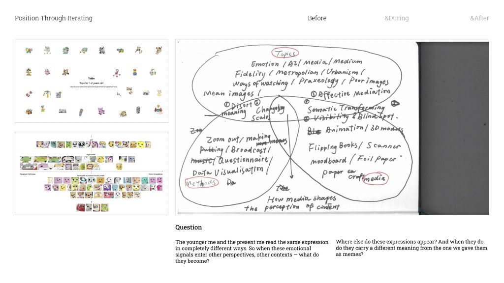
When I looked back at my Unit 1 work through the Venn Diagram, I realised something — all my projects had actually been circling around the same question without me fully noticing. That question is basically: what happens between a medium and the content inside it?
In Methods of Cataloguing, I collected faces from Mattel toy packaging and turned them into memes. And something interesting happened. The expressions that were designed to feel warm and positive for children started reading completely differently to an adult eye. Encouragement became sarcasm. Joy became mockery / ˈmɒkəri /.
And that made me think — the way I would have read these faces as a kid versus how I read them now are completely different things. So the question became: if the same image changes depending on who’s looking at it, what happens when it moves into completely different contexts?
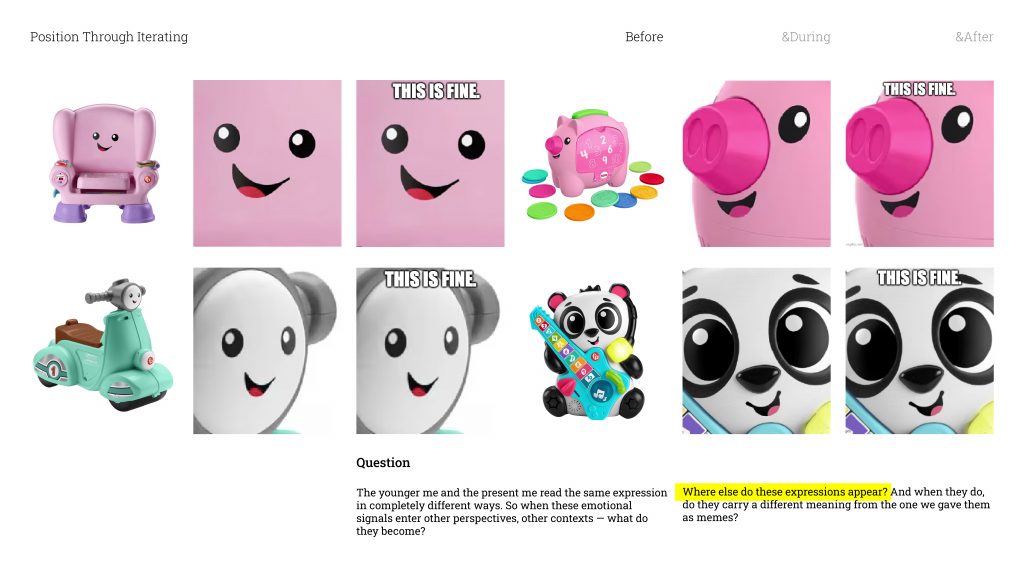
So I started with the most straightforward question I could think of: where else do these expressions actually show up? And when they do, do they get read differently?
When I took one of the smiley faces and put it into a shopping app’s image search. It returned completely unrelated products, different functions, different descriptions, different prices. In the world of that shopping platform, that expression wasn’t a face anymore. It was just a product. it made me realise that every medium has its own internal logic for what an image is and what it means.
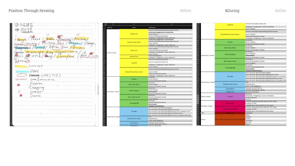
So from there, I started mapping out every image recognition tool I could think of. After going through them and filtering, I landed on twenty tools. And I organised them into seven categories
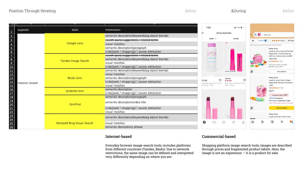
Let me explain what those categories actually are.
Internet-based is basically the image search in browsers. I chose a few well-known ones, but I also made sure to include tools from different countries — Yandex from Russia, Baidu from China. And the reason is network control. In China, for example, the search results are cut off from images hosted outside the country. So the same image, run through different national browsers, can come back with completely different definitions. The geography of the internet shapes what an image is allowed to mean.
Commercial-based is the shopping platform tools I mentioned. The way these systems talk about images is very functional — prices, fragmented labels, product categories. The image stops being a face. It becomes something with a price tag.
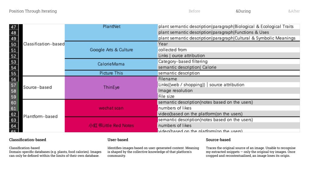
Classification-based tools work from a specific subject database — think plant identification apps, or tools that calculate food calories. To these tools, whatever isn’t already in that database essentially doesn’t exist .They can only define what they already know.
User-based platforms are a bit different — they identify images by cross-referencing what users on that platform have already posted. So the meaning of an image gets shaped entirely by the community. It’s a kind of collective definition.
Source-based tools are designed to track down where an image originally came from. But none of them could recognise my snippets / ˈsnɪpɪt /. They could only trace back to the original full toy images which means once you crop something out and put it in a new context, it loses its traceable origin. It becomes something new.
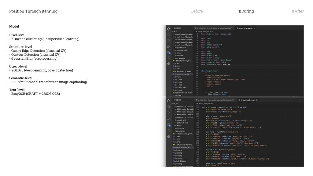
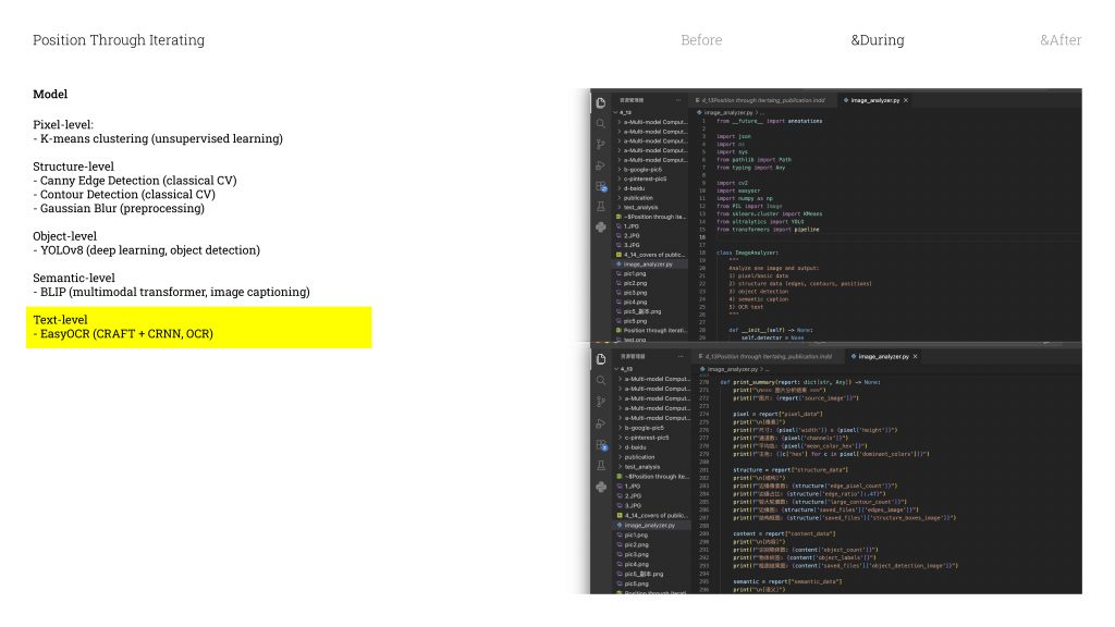
And then the last category is the Python pipeline I built myself. It’s made up of five different models, and each one looks at the image in a different way.
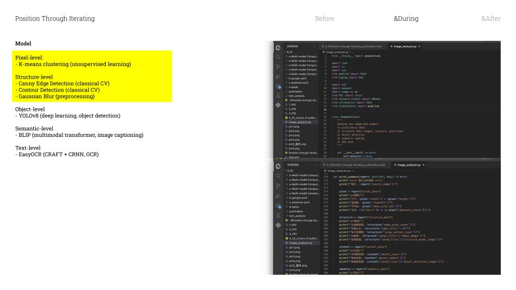
The first is just pixel analysis / əˈnæləsɪs /
— the most basic level. It reads the image purely just as raw numbers.
The second is edge detection. this model is find the places in the image where the shift between light and dark is the most dramatic. It’s not seeing a face. It’s literally just seeing contrast gradients.
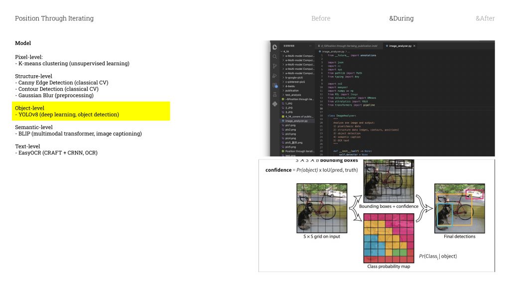
Then there’s YOLO, which stands for You Only Look Once. It divides the image into a grid of tiny cells, and every single cell simultaneously
/ ˌsɪm(ə)lˈteɪniəsli / asks itself: is there an object here? And if there is — what does it look like most? And then it choose the highest probability answer .What makes YOLO different from the other tools is that it’s not searching through a catalogue for a visual match. It’s reading the overall impression of the image. It’s kind of like how you recognise a dog — you don’t count its legs or measure its ears, you just know, because you’ve seen enough dogs that it becomes instinctive
/ ɪnˈstɪŋktɪv /. It works the same way. After being trained on millions of images, it develops something like its own visual intuition / ˌɪntjuˈɪʃ(ə)n /
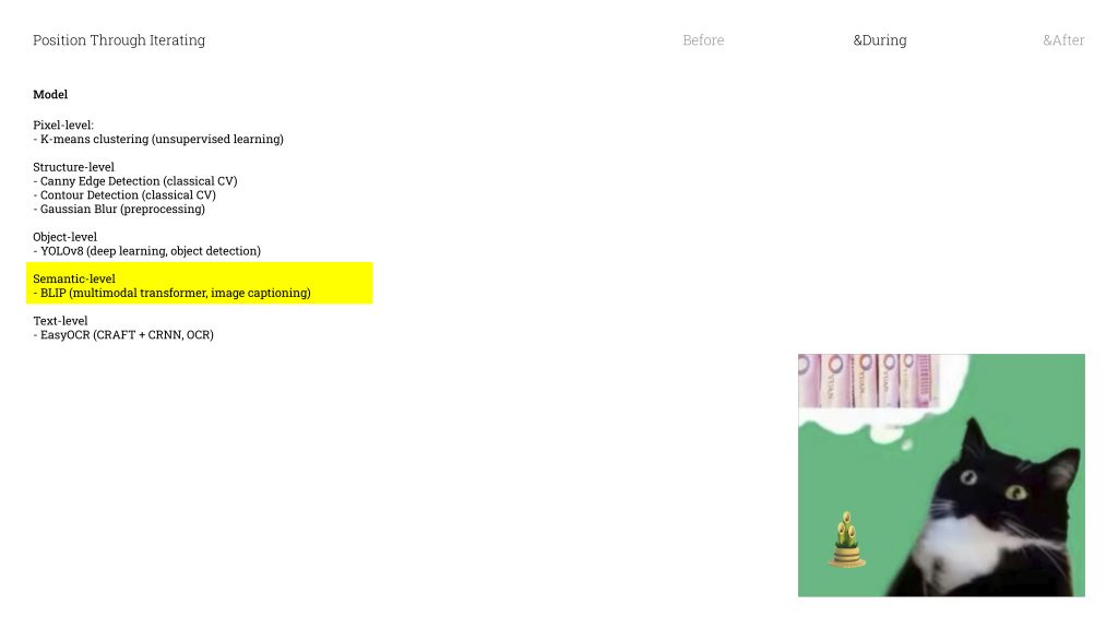
Next is Captioning. This model takes the visual features it detects and uses probability to turn them into a natural language sentence. It’s not actually understanding the image in any meaningful way — it’s calculating which combination of features most likely produces a certain description. So take this image on the left: it’s a black-and-white cat with bamboo emoji. The model detects animal shape, black and white tones, bamboo. And in its trained system, that combination of features points most strongly toward panda. So it outputs: panda. Even though we’re looking at a cat.
The last model is OCR — which converts images into text. It works similarly to something like Adobe Scan.
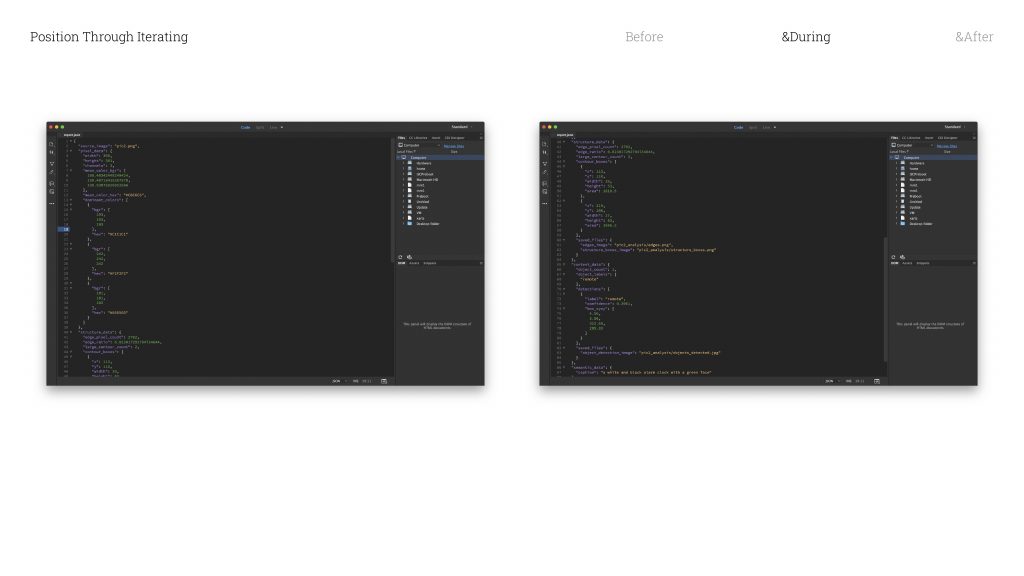
Once an image has been through all five models, the pipeline generates a report. And that report is essentially the combined “opinion” of these five systems. It is what they collectively think the image is.

So I took my five snippets and ran each of them through all twenty tools. That gave me one hundred iterations in tota. I organised all of that by tool category, and used that structure as the framework for the publication.
And this is what the book ended up looking like.


-
Methods of Contextualising
Digital Carbon Emission-Feb 20th

Script
“Hi, we’re Valerie, Miko, Tianyu, and Dasha. This is our Unit 1 update on Methods of Iterating. We’ll walk you through how we moved from research into digital carbon, to a prototype, and then to a publication concept that makes the issue easier to perceive and act on.”
Script
“First, we collectively decided to focus on digital carbon — the emissions connected to everyday digital activity, like devices, networks, and cloud services. It’s often discussed as a relatively small share of overall emissions — commonly estimated around a few percent — but it’s growing fast as digital services become embedded into daily life.
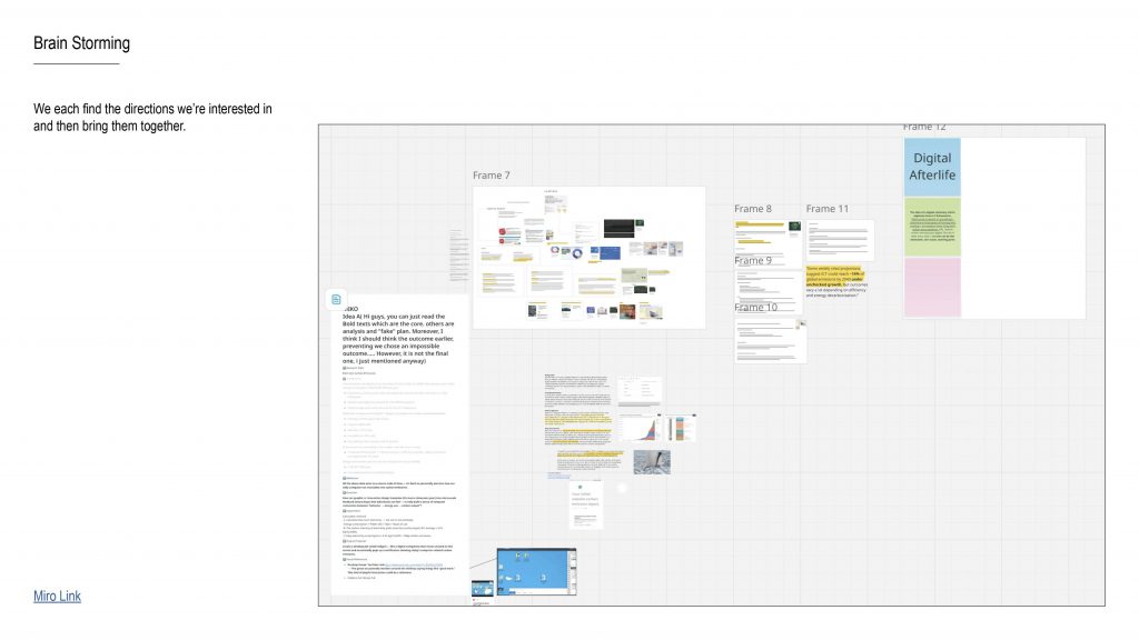
We started with research, then opened up a wide brainstorm on a Miro board: different formats, interaction ideas, and ways to make the topic feel more engaging, more personal, and more actionable, instead of staying as abstract statistics.”
Script
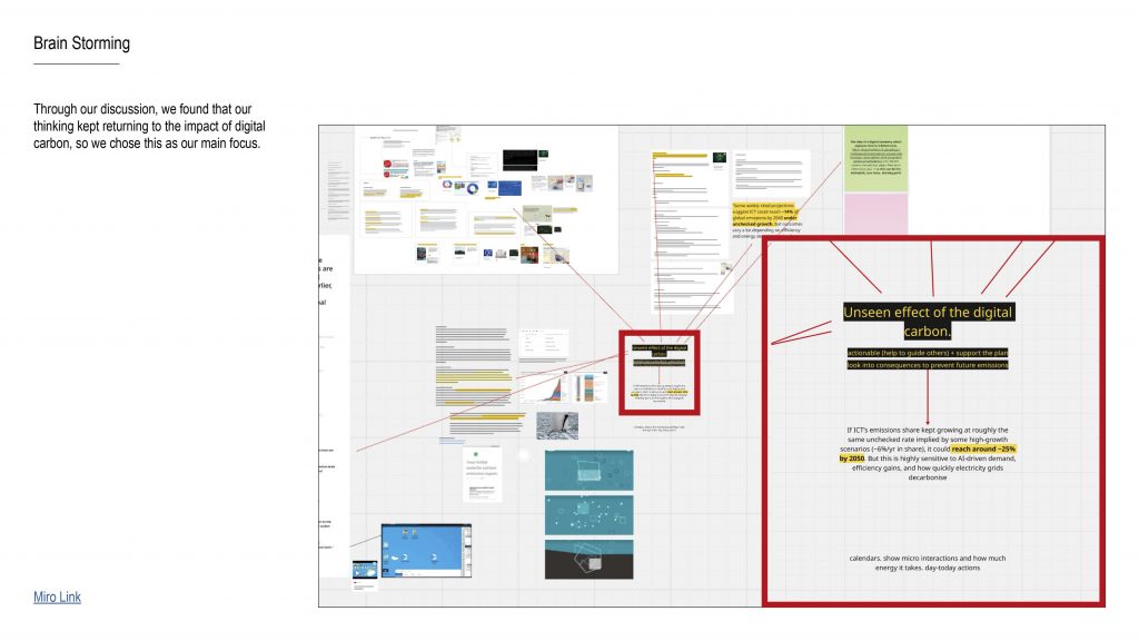
“As we discussed, our thinking kept returning to one key issue: digital carbon is easy to overlook because it doesn’t feel visible, and it often appears ‘small’ compared to other sectors.
So we reframed our focus around the unseen effect: even small emissions can accumulate over time, and because digital habits are widespread, they’re also something we can potentially reduce through collective effort.”
Bridge line:
“So our question became less about ‘is it big or small’, and more about: why is it so easy to ignore — and what would make it feel real?”
Script
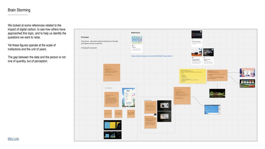
“We reviewed existing references and projects dealing with digital carbon, to understand how the topic has been communicated so far — and what feels missing.
A lot of the existing material works at the scale of institutions and the unit of years. That’s useful, but it creates distance.
So we identified a key gap: the gap between data and a person is not only about quantity — it’s about perception. People don’t feel yearly totals emotionally, and they can’t link them to everyday behaviour.”
Script
“Hi, we’re Valerie, Miko, Tianyu, and Dasha. This is our Unit 1 update on Methods of Iterating. We’ll walk you through how we moved from research into digital carbon, to a prototype, and then to a publication concept that makes the issue easier to perceive and act on.”
Script
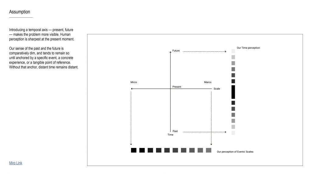
“Our first assumption is that adding a temporal axis — present, past, future — makes the problem more visible.
Human perception is sharpest in the present moment. The past and future feel vague unless they’re anchored by something concrete — a specific event, a tangible object, or a lived experience.
So the design opportunity is: if we can create that anchor, then distant time doesn’t stay distant.”
Script
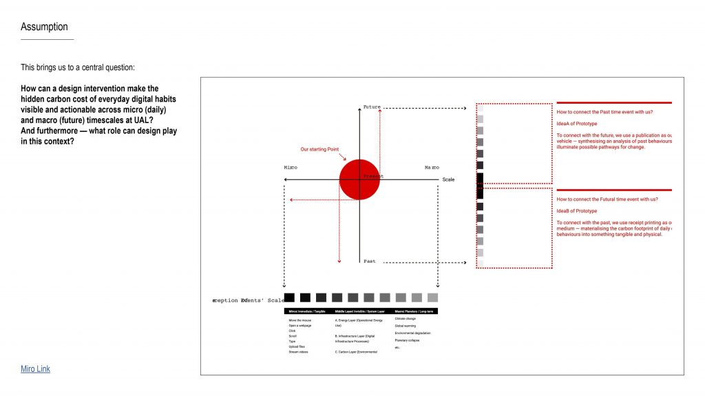
“This brings us to our central question:
How can a design intervention make the hidden carbon cost of everyday digital habits visible and actionable across micro (daily) and macro (future) timescales at UAL?
And more broadly: what role can design play in turning climate-related data into something people can actually sense, understand, and respond to?”

Script
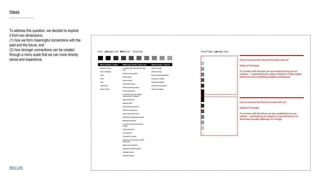
“To respond, we explored two connected dimensions:
-
How we form meaningful connections with the past and future, and
-
How the micro scale — daily behaviour — can be made more legible through direct, sensory experience.
So we’re designing not just an explanation, but a shift in how the issue is felt: from abstract information to something that lands in everyday life.”
Script
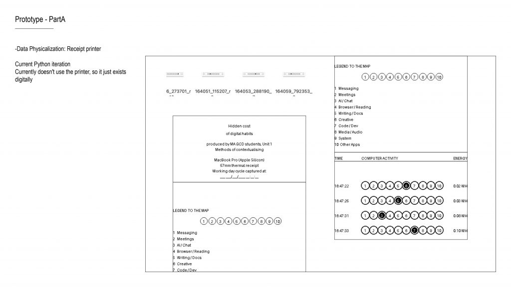
“Our first direction uses data physicalisation — translating behaviour and its consequences into something you can experience through your senses.
We propose a Time Receipt Printer: a device that tracks a user’s computer activity and prints a receipt in real time. Each receipt line registers what happened and an estimated carbon cost.
The key metaphor is the receipt: it normally represents a transaction you accept without thinking. Here, it represents the hidden ‘cost’ of daily digital habits. By printing continuously, the receipt can physically grow, turning invisible accumulation into something you can’t ignore.
So the past stops being a number in a report — it becomes something that occupies space in the present.”
Small clarity tweak (optional):
“Right now we’re prototyping at the level of app activity categories, and iterating toward more granular behaviours later.”
Script
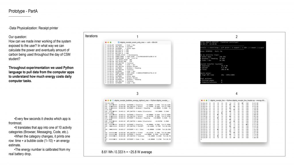
“Our prototyping question was:
How can we expose the inner workings of the system to the user — and how can we estimate energy and carbon from everyday student computer use?
To test this, we built a Python prototype that logs activity and produces a receipt-like output. The flow is:
-
Every few seconds, it checks which app is frontmost.
-
It translates the app into one of about ten activity categories — like Browser, Messaging, Code, etc.
-
When the category changes, it prints one row: time, a bubble code for the category, and an energy estimate.
-
The energy estimate is calibrated using a real battery drop measurement — so it stays grounded in a real device session.”
Script
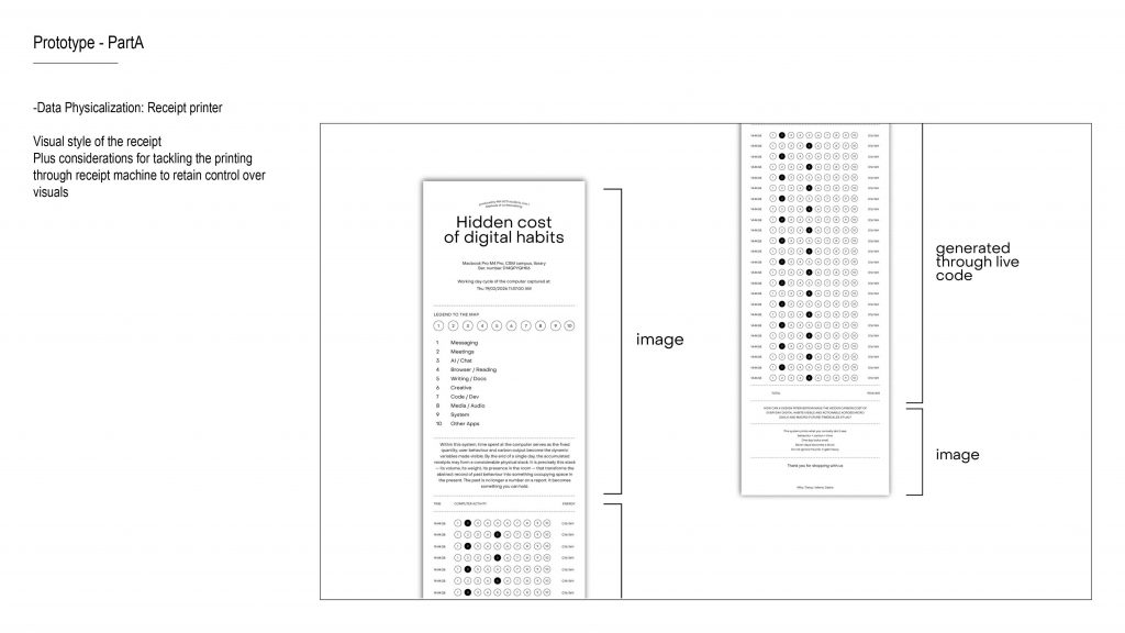
“Here we started defining the visual language of the receipt — what makes it readable at a small width, and what can be reliably printed by a receipt printer.
We’re also considering technical constraints: receipt printers are limited in resolution and colour, so the design needs to stay high-contrast, simple, and consistent”
Script
“At the moment, the prototype output exists digitally and doesn’t yet print directly from the receipt machine — but it already generates receipt-like rows and category codes.
So the next step is connecting the pipeline end-to-end: logging → formatting → direct printing, while keeping the visuals consistent.”
Script
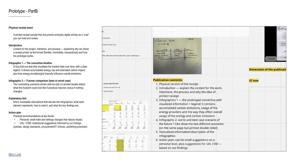
So for Part B, we developed a publication that extends from our physical installation.
The publication is structured into four sections.
The first section includes the actual receipts we printed.
These receipts visualize the carbon emissions generated by our everyday computer use.
They transform what is normally invisible accumulation into something tangible — something you can literally hold in your hands.The second section introduces the project itself, including the background, the research context, and our core question.
The third section consists of two infographics.
One presents a worst-case scenario of future carbon emissions.
The other explores the most ideal scenario and what reduction might realistically look like.The final section is educational.
It moves from the individual scale to the institutional scale, discussing practical ways digital carbon emissions could be reduced.
Script
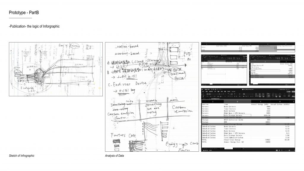
This is our first draft of the infographic.
Script
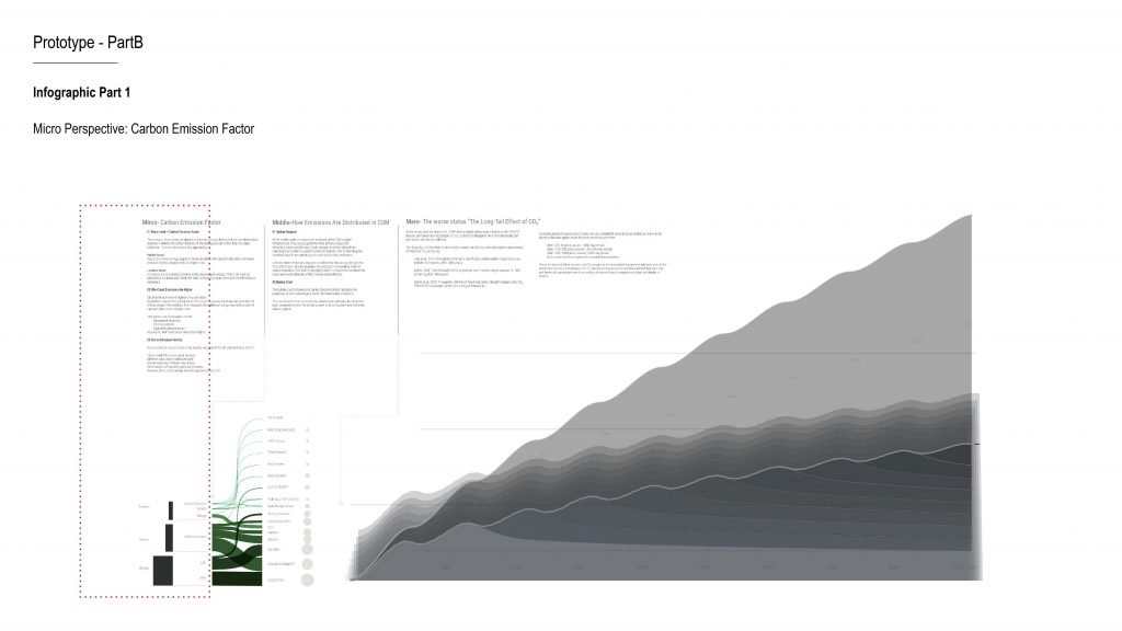
During our analysis, we identified a very important micro-level perspective — the carbon emission factor.
This factor depends on the energy mix of the electricity supplier.
So in other words, the same amount of electricity consumption can result in very different carbon emissions depending on where that electricity comes from.Across our three main categories, we calculated three different emission factors.
Cloud storage has the highest factor.
This is because, in addition to the base electricity emissions, it also needs to be multiplied by a PUE factor — Power Usage Effectiveness — which measures the energy efficiency of data centres.This helped us realise that carbon emissions are not just about how much electricity is used, but also about where that electricity comes from and how efficiently it is managed.
Script
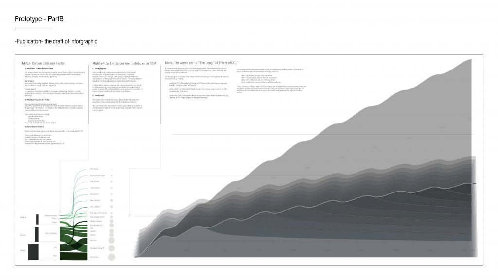
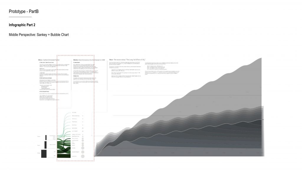
The second infographic combines a Sankey diagram with a bubble chart.
We broke the three major categories down into smaller subcategories and visualised their proportions.
This allows us to clearly see, within CSM’s digital infrastructure, which components account for the largest share of emissions.
For example, optical fibre infrastructure appears visually significant in proportion.
This reminds us that digital carbon emissions are often embedded within underlying infrastructure — not just in end-user devices.
Script
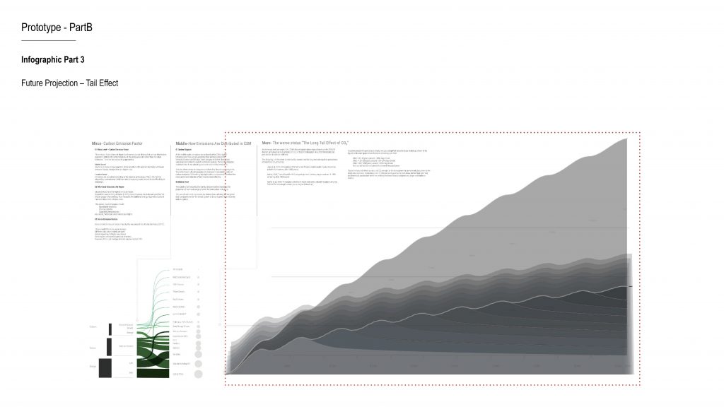
In the final section, we shift to a future perspective and re-examine this year’s carbon emissions over time.
We introduce what we call the “tail effect,” which refers to the long-term persistence of carbon dioxide in the atmosphere.
We used AI to simulate how much of today’s emissions would remain every 50 years.
In the worst-case scenario, we assume emissions continue to increase.
We subtract the Earth’s natural absorption capacity, and what remains accumulates over time.
This produces a stacked area chart that visualises long-term carbon persistence.In the ideal scenario, we start by reducing the carbon emission factor — for example, by switching to market-based electricity suppliers.
However, we are still thinking about what further optimisation could look like, particularly in terms of cloud storage and network usage.
How minimal can our digital infrastructure realistically become?Ultimately, these two infographics function as a comparison:
What happens if we do nothing?
And how much could change if we restructure the system?and then next is the structure of our prototype
Script
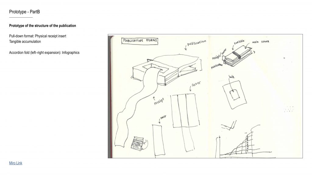
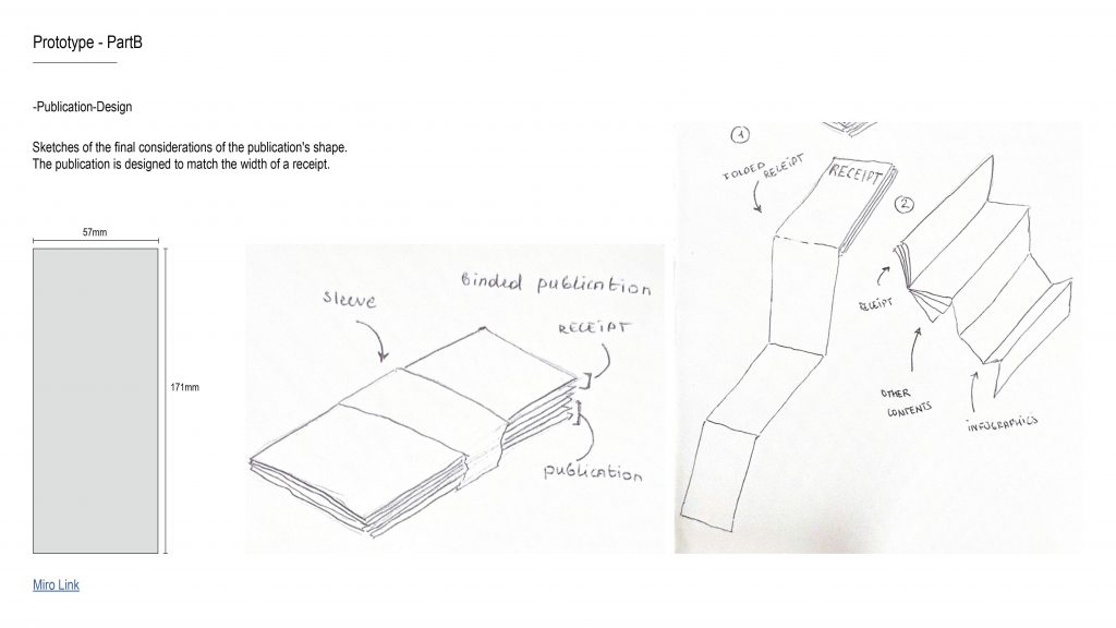
We also discussed different binding and format options for the publication, and eventually decided on this structure.
The size of the publication matches the width of the receipt, so they can integrate seamlessly.
The long receipt is folded vertically and inserted into the book, while the wider infographic is folded horizontally to fit inside.
Script
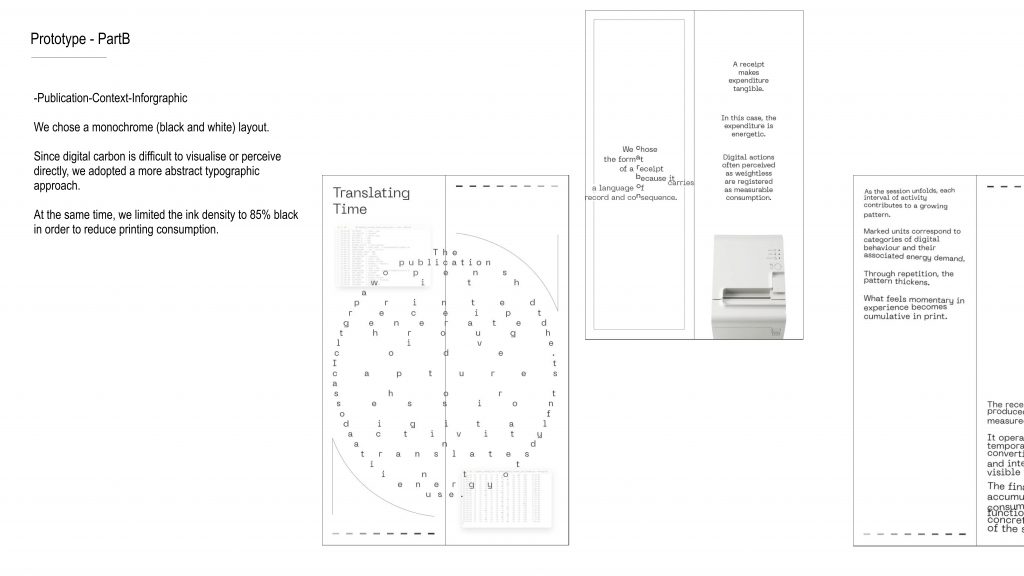
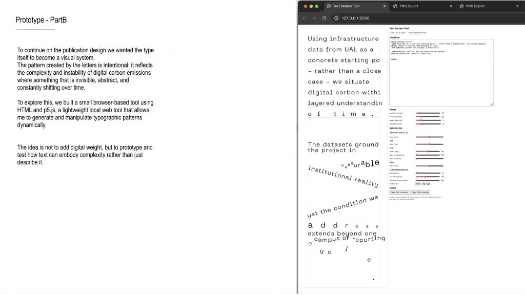
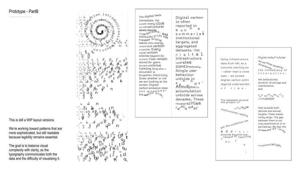
We chose a monochrome layout — so just black and white.Because digital carbon is something we can’t really see, we decided to work with a more abstract typographic approach to reflect that invisibility.And we also limited the ink to 85% black, as a small gesture to reduce printing consumption.
Script
We also discussed different binding and format options for the publication, and eventually decided on this structure.
The size of the publication matches the width of the receipt, so they can integrate seamlessly.
The long receipt is folded vertically and inserted into the book, while the wider infographic is folded horizontally to fit inside.
Script
We chose a monochrome layout — so just black and white.
Because digital carbon is something we can’t really see, we decided to work with a more abstract typographic approach to reflect that invisibility.
And we also limited the ink to 85% black, as a small gesture to reduce printing consumption.
-
-
Method of Translating
Studio work
10_31_presentation
I chose four different ways to translate the same piece of dialogue.The first way was to use directional symbols to simulate the tone and rhythm of spoken language—trying to express the emotional shifts in the speaker’s voice through the strength, direction, and speed of the symbols.
The second way was to translate emotions directly through emojis. This is an extremely condensed form of emotional expression, where all the complex feelings are forced into a single simple icon.
The third way was to let AI handle the translation. This required me to first become the listener—to sense the tone and emotions, and then summarize them into text. But during this process of “textualization,” I felt that many emotions were lost. It was like doing subtraction: I diluted the original emotional intensity before handing it to the AI, and then the AI performed its own arithmetic, generating a dialogue that looked the same but was fundamentally different.original version
2 versions of transcribe with description of emotion
-Version 1
Liam
[emotional] I love you.Alice
[anger] Where?Liam
[emotional] What?Alice
Show me [anger] Where is this love?
I, I can’t see it.
I can’t touch it.
I can’t feel it.
I can hear it.
I can hear some words, but I can’t do anything with your easy words.
[helplessness] Whatever you say. It’s too late. [helplessness]Liam
[hoplessness] Please don’t do this.Alice
It’s done. [firm][resigned][exhausted]
Now please go or I’ll call security.Liam
[defiance] No, you’re not in a strip club. There is no security.Liam
Why do you fuck him? [anger][furious]Alice
I wanted to. [indifferent][resolute][provocative]Liam
[anger] Why?Alice
I desired him. [indifferent][resolute][provocative]Liam
Why? [anger][yell]Alice
You weren’t there! [anger][accusatory]Liam
Why him? [anger][furious][yell]Alice
He asked me nicely. [provocation]Liam
You’re a liar! [heartbreak][sadness]Alice
So?Liam
Who are you? [rage][anger]Alice
I am no one. [anger][yell]-Version 2
Liam
I love you [emotional]Alice
Where [query][anger]Liam
What [doubt]Alice
Show me [anger] Where is this love?
I, I can’t see it.
I can’t touch it.
I can’t feel it.
I can hear it.
I can hear some words, but I can’t do anything with your easy words.
[helplessness] Whatever you say. It’s too late. [helplessness]Liam
Please don’t do this [despair][heartbreak][fear]Alice
It’s done. [firm][resigned][exhausted]
Now please go or I’ll call security.Liam
[defiance] No, you’re not in a strip club. There is no security.Liam
Why do you fuck him [anger][furious]Alice
I wanted to. [indifferent][resolute][provocative]Liam
Why [anger][furious]Alice
I desired him. [indifferent][resolute][provocative]Liam
Why [anger][furious]Alice
You weren’t there. [anger][accusatory]Liam
Why him? [anger][furious][yell]Alice
He asked me nicely. [provocation]Liam
You’re a liar. [heartbreak][sadness]Alice
So? [mocking calm][defiant sarcasm]Liam
Who are you [rage][anger]Alice
I am no one. [anger]4 versions of Audio(some of them have bug…) translated by AI
The final method was to translate the content through the shape of the mouth—language completely removed, leaving only the physical motion itself.
Among these four methods, I realized that the act of translation itself is not merely a “representation” of the original, but a continuous creation of new understandings and distortions. As emotions flow through different media, they are constantly reconstructed and reborn.
11_07_presentation
I chose to continue exploring the third approach. In the AI-regenerated dialogue, I tried to reawaken the missing emotions by adding background music—giving the voices a renewed sense of “human presence.”
I created four versions: three with different emotional atmospheres of BGM, and one with only the pure AI dialogue. Then, I invited different listeners to experience all four versions and mark the parts that felt “off” or “distorted.” Through this process, I wanted to observe how a sense of authenticity is constructed when emotions are first translated by AI and then re-supplemented by human-made sound.

4 versions of audio with different BGM
Ishikawa Sayuri_1
The sei_1
Ann Byers_1
no BGM_1
results of the experiment
At first, I felt that compared to the original, the AI monologue most obviously lacked the emotional progression—the gradual build-up in the female speaker’s tone leading to the final outburst. However, for listeners who hadn’t heard the original recording, this progression in the quarrel wasn’t something they particularly noticed. What stood out instead was the lack of progression within individual lines.
Based on that, I wondered if music could fill in this missing emotional progression. So, I added a segment of emotionally building sound. I haven’t tested it yet, but when I listened back, it seemed that the absence of emotional progression became less noticeable. It felt as if the missing emotional scent of the AI had dissolved under the influence of music.
Emotion progression with music progression
Reflection
That made me start thinking: in language, how much do the literal content and the number of words matter, compared to the atmosphere of the dialogue—the background music, for example? What actually guides our understanding of a conversation? Is it the linguistic content itself, or the emotional rhetoric we’ve gradually built through different contexts of interaction? If it’s the latter, then besides music, what else could it be? Body language? Eye contact? And if this dialogue were no longer a dialogue at all—but transformed into another medium—would the emotional resonance it conveys still remain the same, or would it deviate?11_10_Extension
The same piece of dialogue, when translated into different media, always changes in how I receive and interpret it.
In the medium of a podcast, for example, the AI-generated version adds narration and explanatory information. Its analytical quality becomes stronger, while the emotional tension of the original conversation is weakened. It sounds more like an analysis or deconstruction than an emotional exchange.
Broadcast translated by AI
broadcast
Music translated by AI
Style: for running
Style: lo-fi, hip hop, 70 bpm
Conversely, when the same material is used to generate music, the grammar of the medium shifts entirely. When set to “lo-fi, hip hop, 70 bpm,” the work still retains the dialogue—it feels like a conversation accompanied by background music. But when set to “for running,” the music completely detaches from linguistic content, transforming into a pure expression of rhythm and energy.
This made me realize once again: when the same linguistic content is translated across different media, it’s not only the form that changes, but also the way perception and understanding are reconstructed. The medium itself becomes part of the meaning-making process.
Audio Collection
YouTube(Time stamp included):
https://youtu.be/RSWJg-vWqv8?si=pIkzLU3WHRrhZXu3
Google Drive(Spare/Single audio included/no time stamp):
https://drive.google.com/drive/folders/141JVHHiu-u93Ft4Z9tHHAss7wgdfbC5q?usp=sharing
Time Stamp:
00:00 Original Audio
00:50 Process of Translating in AI — Version 1
01:46 Process of Translating in AI — Version 2
02:39 Simulated Tone (no BGM)
03:29 Simulated Tone + BGM (Ishikawa 2015)
04:19 Simulated Tone + BGM (Byers 2009)
05:11 Simulated Tone + BGM (The Sei 2018)
06:01 Media Shift Testing — Broadcast
07:32 Music: lo-fi, hip hop, 70 bpm — Version 1
08:29 Music: lo-fi, hip hop, 70 bpm — Version 2
09:47 Music: for running — Version 1
12:25 Music: for running — Version 2
Studio Work reference
Film
Nichols, M. (2004) Closer. Available at: https://www.youtube.com (Accessed: 16 November 2025).
Music (for BGM Experiments)
Ishikawa, S. (2015) ちゃんと言わなきゃ愛さない. ちゃんと言わなきゃ愛さない. Available at: https://www.youtube.com (Accessed: 16 November 2025).
Byers, A. (2009) I’m happy without you. Best Of Lash Records. Available at: https://www.youtube.com (Accessed: 16 November 2025).
The Sei. (2018) Metroma. Metroma. Available at: https://www.youtube.com (Accessed: 16 November 2025).
AI Tools Used
ListenHub (n.d.) ListenHub – AI audio-to-broadcast transformation. Available at: https://listenhub.ai/zh (Accessed: 16 November 2025).
UDIO (n.d.) UDIO – AI music generation platform. Available at: https://www.udio.com (Accessed: 16 November 2025).
Minimax (n.d.) Minimax – AI audio voice recreation. Available at: https://www.minimax.io/audio (Accessed: 16 November 2025).
ElevenLabs (n.d.) ElevenLabs – AI voice and tone synthesis. Available at: https://elevenlabs.io (Accessed: 16 November 2025).
Written Response
This piece re-presents Hito Steyerl’s In Defense of the Poor Image through the multi-style structure of Raymond Queneau’s Exercises in Style.
“The networks in which poor images circulate thus constitute both a platform for a fragile new common interest and a battleground for commercial and national agendas. They contain experimental and artistic material, but also incredible amounts of porn and paranoia. While the territory of poor images allows access to excluded imagery, it is also permeated by the most advanced commodification techniques. While it enables the users’ active participation in the creation and distribution of content, it also drafts them into production. Users become the editors, critics, translators, and (co)authors of poor images.” (Steyerl, 2012)
Poetic Version
A fragile ecology, a silent battlefield—
both are born from the ghosts of these images.
They gather like mountains and rivers converging into a single stream—
at once clear and murky, filthy and pure, elevated and base,
transcendent yet worldly.
The fish drink from the river to quench their thirst,
yet in drinking, they too become part of the river itself.Brief Style
The benefits brought by poor images are unstable,
forming at once a contested arena for commercial and national agendas.
Their contents are uneven in quality.
For users, poor images ignite creativity—
yet they also absorb that very creativity to reinforce their own system.Personified Dialogue
- Poor Image:
“My circulation grants you certain benefits, yet it also becomes a stage for the rivalries of commerce and politics.” - Viewer:
“Those benefits you speak of—so fleeting, so uncertain. I haven’t forgotten the vulgarity, the pornography, and the paranoia that fill your veins.” - Poor Image:
“Everything has two faces. Admittedly, I am not pure. But precisely because of that, the experimental and the artistic—those cast out by the mainstream—can find their way through me.” - Viewer:
“I admit, you’ve shown me what I couldn’t otherwise see. But aren’t those revelations merely generated by my own data, calculated and returned to me?” - Poor Image:
“Still, I awaken your creativity. You film, you share, you remake.”
Personified Dialogue (Romantic Dramatic Style)
- Poor Image:
“My flow makes you feel seen, even warmed.
Yet at the same time, I’ve become the stage where power and desire intertwine.” - Viewer:
“The warmth you promise—so fickle, so uneven.
Don’t think I haven’t noticed your impurities:
the vulgar, the obscene, the paranoid—all glowing through your light.” - Poor Image:
“I was never meant to be perfect.
It is through my impurity that the beauty exiled by the world finds shelter within me.” - Viewer:
“Perhaps. You’ve shown me what I could never have seen.
But don’t forget—what you show is drawn from me:
my desires, my clicks, my pauses—they are all the language of your algorithm.” - Poor Image:
“But I’ve changed you too. You film, you write, you cut again.
You’ve gained a larger stage—not only to watch or to click,
but to pour out your inspiration,
to resonate with your own creative soul and your longing to express.
You think it’s for me, but it’s for yourself.” - Viewer:
“No—it’s you who need me.
You feed on my creativity, my comments, my translations, my fervor—
they are the fuel for your system.
We think we’re in love, but in truth, we’re consuming each other.” - Poor Image:
“Isn’t that what love always is?
Between giving and taking—who can ever tell who is using whom?” - Viewer:
“Don’t forget—you also thrive on that creativity. The platform harvests our videos, our comments, our translations, our edits—your very fuel.
We think we are creating, but in truth, we are laboring for you. You absorb our participation, fold it into your system, and turn it into your own productivity.”
Conclusion
Transforming an academic paper into a completely different textual style not only alters the way emotions are conveyed but also clarifies and enriches the internal relationships within the text. In Steyerl’s original writing, the poor image functions as an objective subject, analyzed in terms of its roles and effects across different fields. However, when reinterpreted in the form of a dialogue, the “viewer” — the affected party — becomes clearly defined, and the relational context between the viewer and the poor image becomes more discernible, revealing a dynamic of mutual causality. I believe this approach can also be applied to other subjects mentioned by Steyerl — such as “the battlefield of commercial and national agendas” or “fragile interests” — allowing for a renewed interpretation through such retranslation. This process enables us to grasp more concretely the influence of the poor image across various domains, as well as the broader system in which it operates.
References
Steyerl, H. (2012) In Defense of the Poor Image.
Queneau, R. ([1947] 1998) Exercises in Style.
- Poor Image:
-
Method of Cataloguing
Response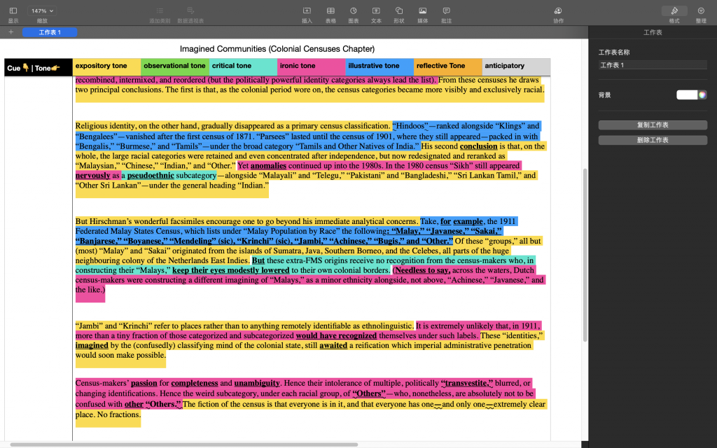
In this prompt, I attempt to construct a “tone inventory” for Benedict Anderson’s Imagined Communities, focusing on his discussion of the “census.” By categorizing sentences according to reflective, explanatory, illustrative, and critical tones—and identifying the linguistic markers that reinforce these modes, such as the ironic use of quotation marks or the rhetorically charged word “transvestite”—I aim to explore how Anderson’s linguistic tone and textual form participate in the production of knowledge itself as a means of understanding colonial power.
In the introductory section, Anderson’s tone is primarily explanatory—measured, detached, and seemingly objective—as he lays out the theoretical foundation. However, as his argument shifts toward specific examples, the tone transitions into one that is critical and ironic. This irony often emerges through the estranging function of quotation marks or certain lexical choices, prompting readers to recognize that what appears as objective description in fact conceals a layer of critique. For me, this approach is more persuasive than straightforward exemplification, as irony generates a reverse argumentative force.
During my preliminary analysis, I attempted to include rhetorical structure as part of the tonal framework. Yet I later realized that rhetoric is not an external device but an intrinsic quality of language itself—a single word or sign can already perform rhetorical work. The term “transvestite”, for instance, simultaneously operates as metaphor and critique, embodying irony in both form and content.
I believe that fragmenting the text’s tone and structure in this way allowed me to see more clearly the reflective process and the composure required in academic writing, while also acknowledging the presence of a subtle, restrained humor within it. The balance between these tones—where irony and critique serve as secondary layers, and rational exposition and illustration remain central—makes the argument more persuasive and the overall context more coherent.
reference
Benedict Anderson, ‘Census, Map, Museum’, Imagined Communities, 2006 -
Methods of Investigating
Camden Town Field Diary
A week of streets, textures, and urban reflections
First Impressions: The “Camden Image” Gap
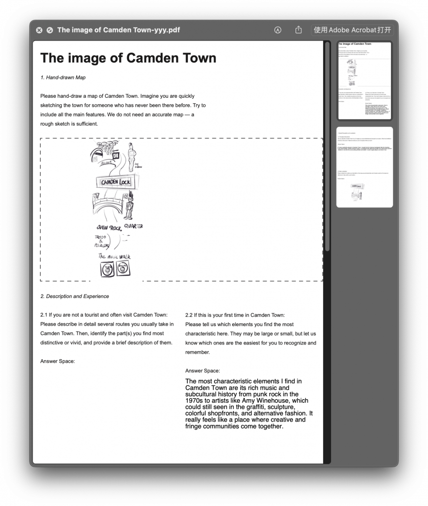
Based on last week’s map research, I realized something curious: my mental image of Camden Town is basically just Camden High Street (・o・).
However, on Google Maps, Camden Town actually covers a much larger area. So, I created a short survey to ask others how they perceive Camden Town. One respondent lives nearby, and two had visited the area with me. Interestingly, their perceptions overlapped almost completely — all centered on Camden High Street. Compared to that main street, the surrounding neighborhoods and parks left much weaker impressions (・・;)。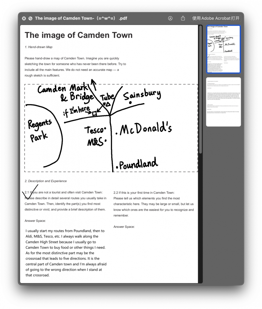
Walking Experience: High Heels on Cobbles
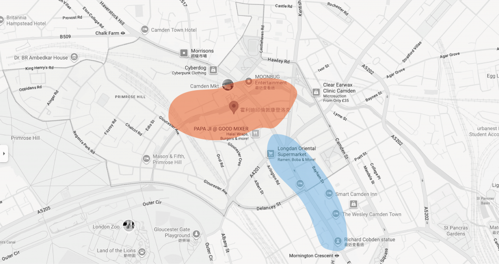
Then I started to wonder: why does this one street define Camden Town’s identity? That day, I happened to wear heels and walked from the Richard Cobden Statue to the Camden Lock Bridge. My biggest takeaway? The road near the bridge is definitely not friendly to heels .
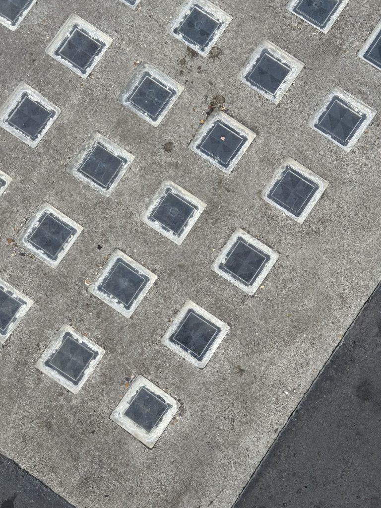
On my way back, I began paying attention to the pavement materials. Around Camden Market, the surfaces were much richer — York stone, cobblestones, granite. Meanwhile, the sidewalks were patchy, like layers of repair over time. This mixture of textures and repairs seems to reflect Camden Town’s gradual gentrification. Across the street, at Water Lane, the new shopping complex had pristine, modern materials — polished, uniform, and new.
Graffiti and Consumption: When Subculture Becomes a Brand
Beyond pavements, I also observed the merchandise and alternative cultural elements. One striking feature is the graffiti art running along the entire Camden High Street. Yet, once graffiti enters Camden Market, it transforms into a consumable symbol.
Brands like Vans and Stussy (both mid-luxury) use graffiti as a core design motif. In these contexts, graffiti loses its original DIY street spirit. It becomes aestheticized and commercialized — only to return to the streets again, accepted and imitated by the public. A curious cycle of cultural feedback.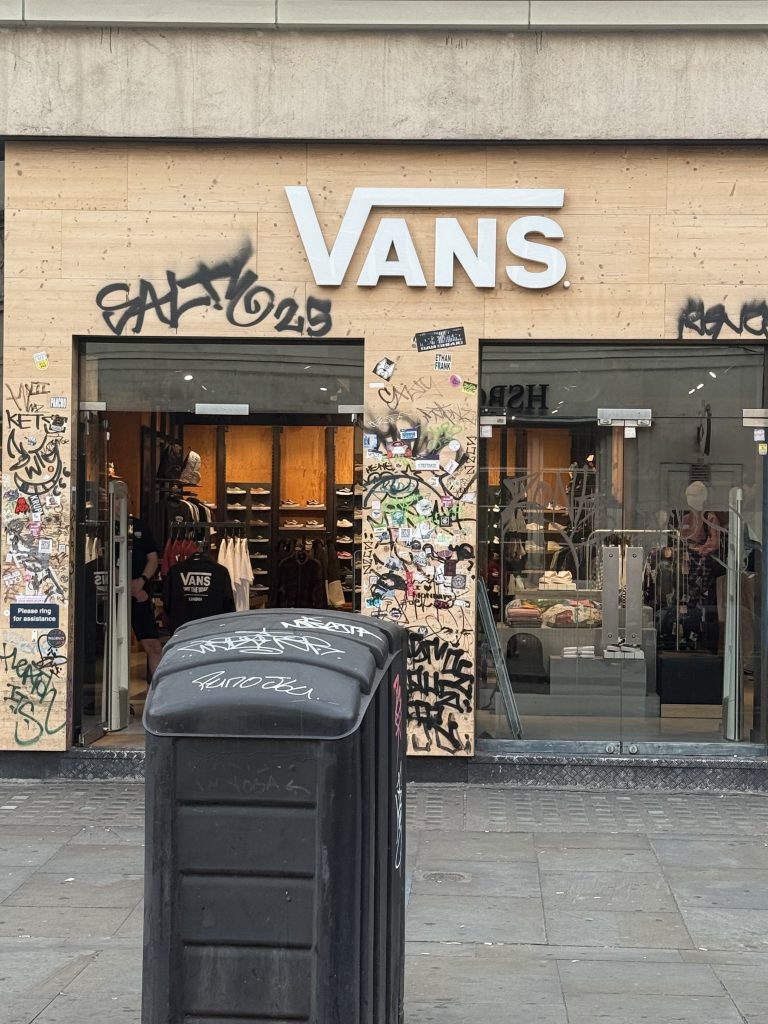
Small Details: Life Between the Cracks
Walking through the residential parts of Camden Town, I noticed tiny plants growing through cracks in the pavement. It’s something you’d never see on a polished pedestrian street — and somehow, that small wildness felt oddly touching .

A Curious Discovery: The Glass Bricks
Later, I asked AI (hehe) what those glass blocks on the ground were. They’re called light wells, designed to bring daylight into basement spaces (how clever! (≧▽≦)). In Camden Town, though, they seem to be more modern — some even have company names on them. It made me wonder : could the expansion of basement spaces be linked to the rising population in Camden?
Fascination with Materials and Texture
After learning more about London’s road renovations, I became fascinated by the texture of street materials. At first, I thought about using rubbings to capture these surfaces. But the results felt too flat — something was missing(´・_・`)。
So I returned to my original observation: what caught my attention was the unevenness near the Lock Bridge. That sense of surface depth. I needed a medium that could better express relief and texture.
I decided to use aluminum foil to sculpt the variations in pavement surfaces. But during the process, I realized foil was too fragile to preserve. So instead, I documented the results through photography.
Smooth vs. Rough: The Dialogue of Urban Materials
New materials such as granite, York stone, and asphalt improve mobility and efficiency, while the traditional cobbled streets near Camden Lock Bridge preserve a sense of historical texture (´∀`)。
I also started treating graffiti as part of the “surface” — along with cigarette butts, plastic bottles, and fallen leaves. I experimented with different ways to record them, like printing and rubbing. But, honestly, some things couldn’t be captured at all (like someone else’s cigarette butt…). So what I ended up printing were… mine and my friend’s (lol).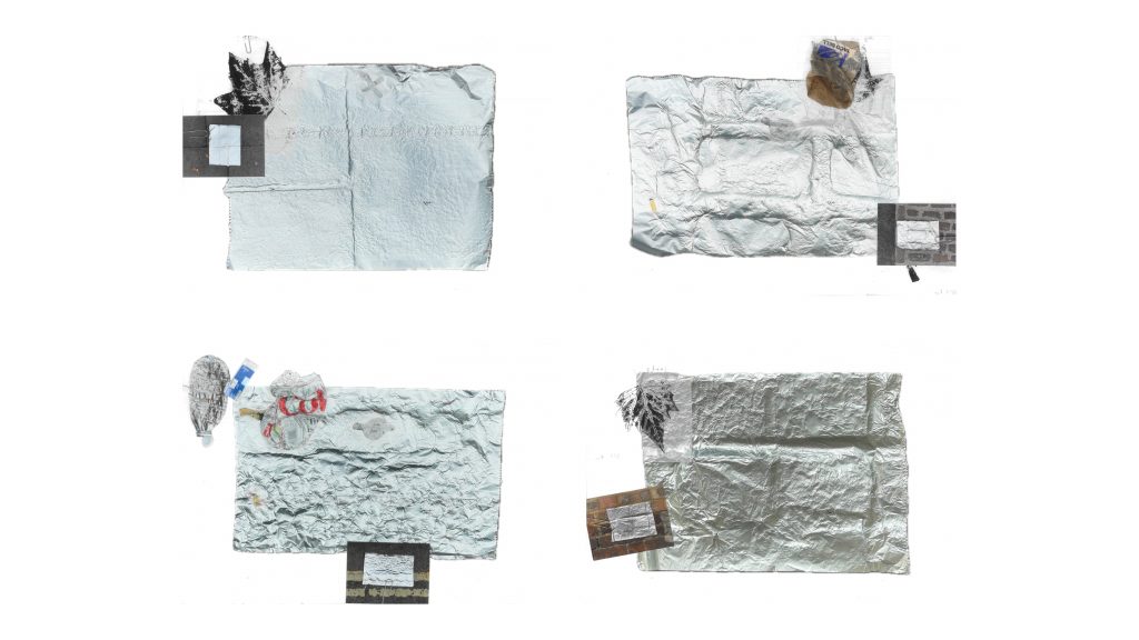
Camden Town as a “Smooth City”
After a week of observations, I feel Camden Town is like a miniature version of what the book calls a Smooth City. And it’s not just about “smooth roads” (•‿•).
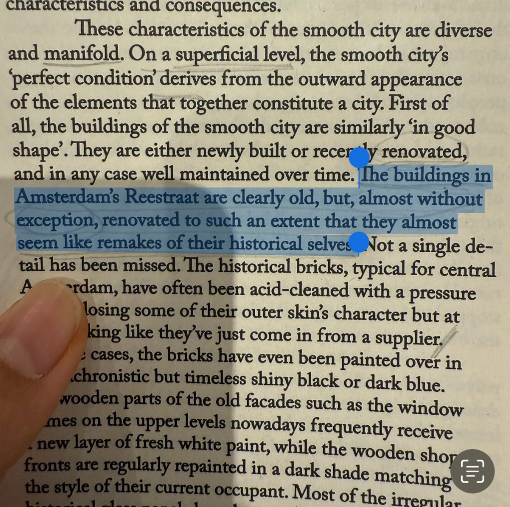
In the book Smooth City, the author discusses Reestraat in Amsterdam and King’s Cross in London — two very different yet related examples of urban “smoothness.” Both places preserve their historical aesthetic, but the materials are brand new, carefully maintained, and selectively displayed. Both are deeply class-coded spaces.
Historically, Camden Town became a hub for alternative culture because of its low rent, which attracted musicians and artists. Now, however, the area primarily serves tourists — a higher-spending demographic.
The “perfection” of Smooth City means different things to different people: for long-term residents, it represents a loss — a fading of memory and diversity; for tourists, it’s a polished place to stay for 3 or 4 hours.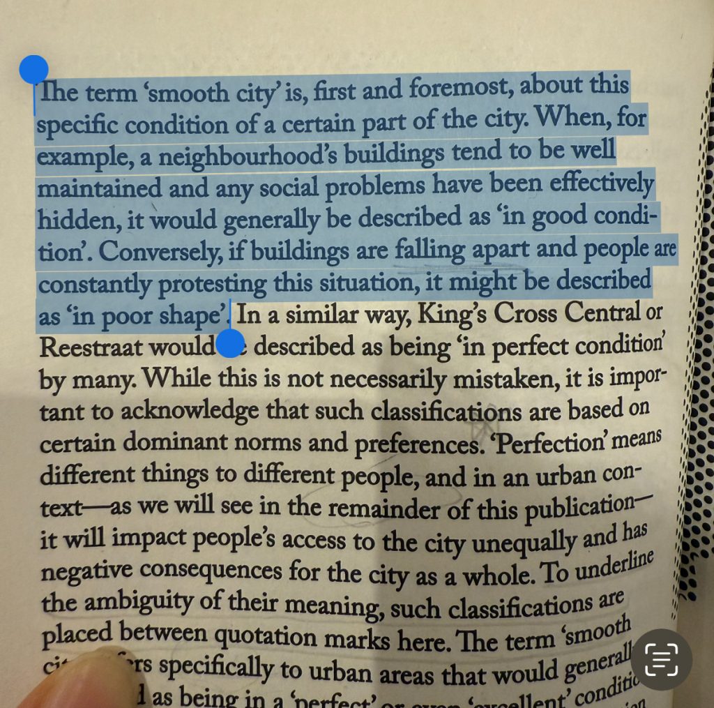
Reflection: Freedom, Fines, and the Street
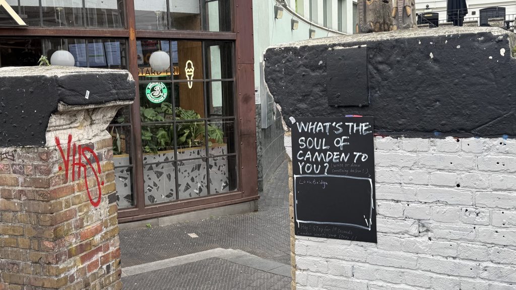
This week’s research made me rethink what “authentic urban space” means. I tried using an open research method — I designed two posters and placed them on the bridge, hoping people would write their comments. But while putting them up, someone warned me I might get fined , so I gave up on the idea.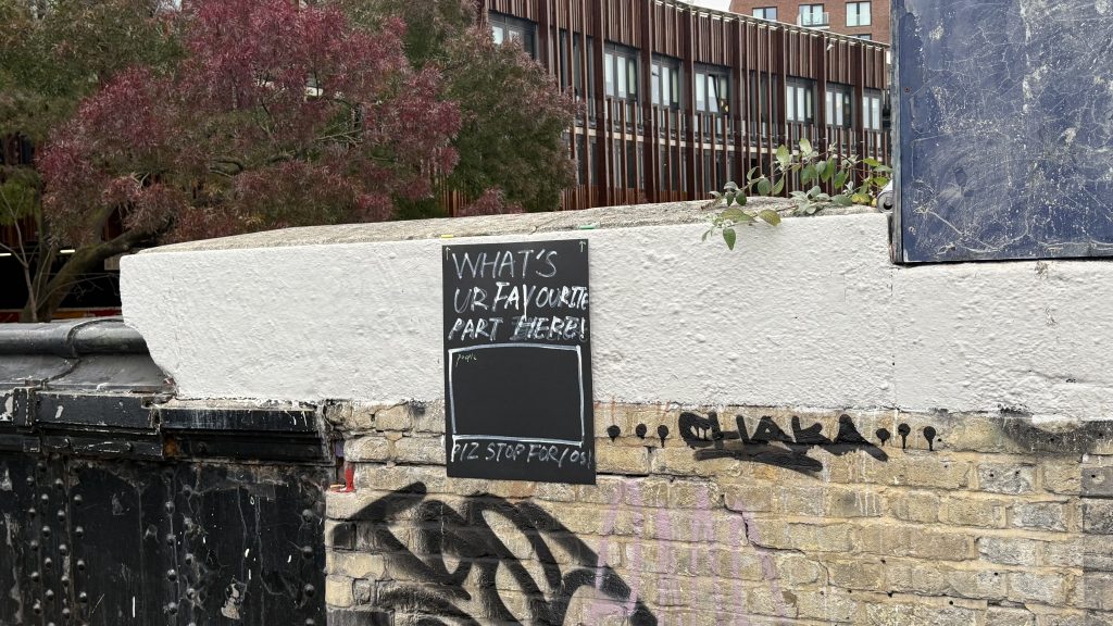
Response
Introduction
My exploration begins with the literal meaning of the chosen area: “Town.” Fundamentally, a town is a political and administrative unit, a concept defined by its jurisdiction, situated above a village. Yet, if we strip away this administrative framework, how do we define the essence of a “Town”? A similar inquiry applies to “The Street.” Perec suggests that traffic patterns can help identify an area, as they often loosely align with administrative boundaries. While practical, I believe our recognition of a place can be more immediate and sensory, grounded in direct experience rather than abstract lines on a map. This perceptual understanding, formed through interaction and memory, warrants deeper reflection. What constitutes the real, lived boundaries of a place in the minds of those who inhabit or pass through it?
Process
To investigate this, I conducted a study inspired by Kevin Lynch’s experimental methods in The Image of the City. I asked students, both residents and visitors of Camden Town, to draw maps from their mental image of the area. Comparing these sketches with the official boundaries on Google Maps revealed a clear pattern: their mental images were intensely concentrated along Camden High Street, while most residential areas and side streets left minimal impression. This prompted a new question: what specific elements along Camden High Street anchor observers’ memories? In The Town, Perec describes his own mental map—devoid of street signs or numbers—shaped purely by personal memories and interactions. This aligns with Lynch’s theory that environmental images emerge from a two-way interaction between the observer and their surroundings. In this light, Camden High Street can be understood as the part of Camden Town that most actively engages with people, forming the core of its collective image.
Form
Walking repeatedly along High Street, I sought to identify landmarks capable of engaging an observer, whether visually or through other senses. I initially focused on graffiti and buildings as visual anchors. However, I found that privatized architecture and ephemeral graffiti often obscured the deeper history that has shaped modern Camden. In Perec’s The Street, a street is defined as a boundary that divides and defines an area. Unlike buildings, changes in a street can signify the transformation of an entire neighborhood. This became tangible underfoot. Walking in high heels, I acutely felt the variations in pavement materials. Near Lock Bridge, the surface was uneven, a patchwork of asphalt and preserved York stone with some cobblestones intact. Further away, the pavement transitioned to uniform granite, designed for efficient commuting. Can these surfaces be compared? Inspired by Varda’s The Gleaners and I, which contrasts past and present to reveal social and gender issues amid urbanization, I realized that comparing Camden’s historical and contemporary street surfaces does more than trace urban change. It symbolizes the process of gentrification, where the subtle shift underfoot becomes a microcosm of broader social transformation—a material testament to the “smooth city” ideal.
(486 words)Reference List
Agnes Varda (2015). The Gleaners & I (2000) Documentary) Full Movie HD Quality. Dailymotion. Available at: https://www.dailymotion.com/video/x2wzh1z.
Boer, R. (2023). Smooth City. Valiz.
Georges Perec, Morris, S. and Sturrock, J. (1974). Species of spaces and other pieces = Pigeon reader. Acklam: Information As Material.
Lynch, K. (1960). The Image of the City. London: The MIT Press.
-
Hello world!
Welcome to myblog.arts. This is your first post. Edit or delete it, then start blogging!