Digital Carbon Emission-Feb 27th
⸻
Slide 1
“Hi everyone — we’re Miko, Dasha, Tianyu, and Valerie. Our project is about digital carbon emissions that happen quietly when we use devices, WiFi, storage, and cloud services.
Our question was: how do you make something invisible feel real — and personal — without overwhelming people with numbers?”
⸻
Slide 2
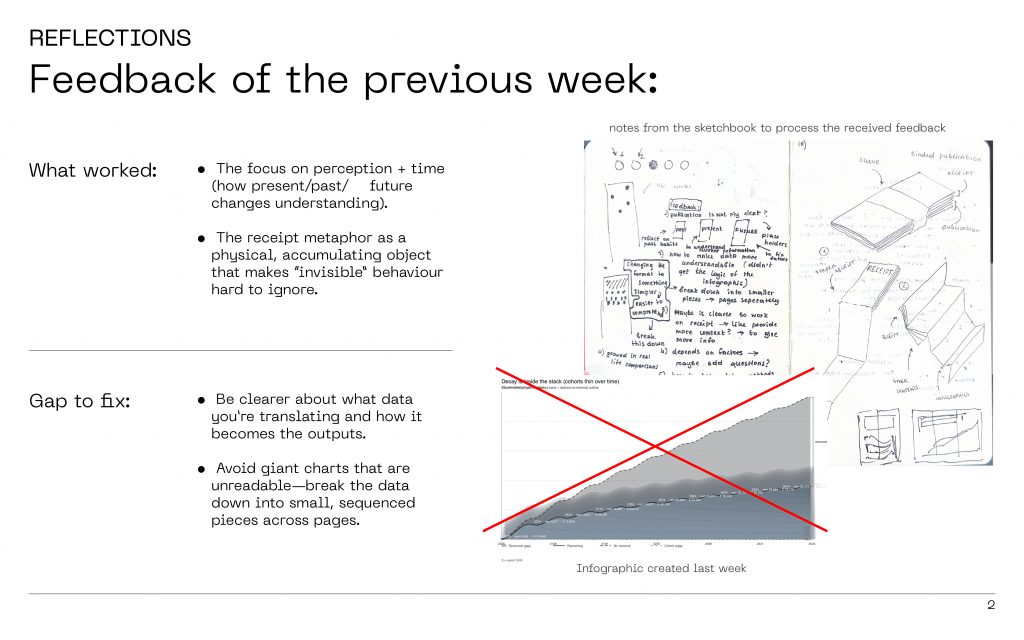
“Last week we got a really clear message from feedback:
First — people liked that we focused on time and perception: how the same number feels different when you see it as today, this year, or over decades.
Second — the receipt metaphor worked well because it turns digital behaviour into something physical that builds up.
But we also had two big gaps:
We needed to be clearer about what data we’re translating and how it becomes our outputs.
And our charts were too big and unreadable — we had to break things down into smaller, sequenced pieces.”
⸻
Slide 3
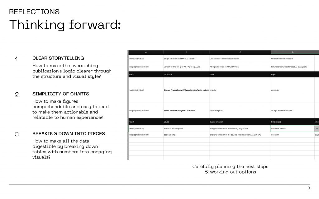
“So we decided on three rules for the next iteration:
1. Clear storytelling — the structure should guide you, like a narrative.
2. Simplicity of charts — fewer numbers on one page, more clarity.
3. Breaking down into pieces — instead of one ‘giant scary graphic’, we make smaller parts you can understand quickly.”
⸻
Slide 4
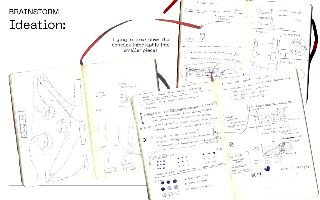
“This slide shows how we started redesigning the whole thing.
Instead of one poster-size infographic, we treated it like a set of small evidence fragments — almost like you’re discovering the information step by step.
That decision shaped everything: the format, the pacing, and how we guide attention.”
⸻
Slide 5
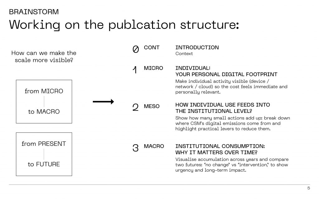
“Our structure moves across scale and time.
We start at micro: your personal footprint — because that’s where attention is.
Then meso: how individual actions feed into CSM’s shared infrastructure.
And then macro: what happens when emissions accumulate over years — and what changes if we intervene.”
⸻
Slide 6-7
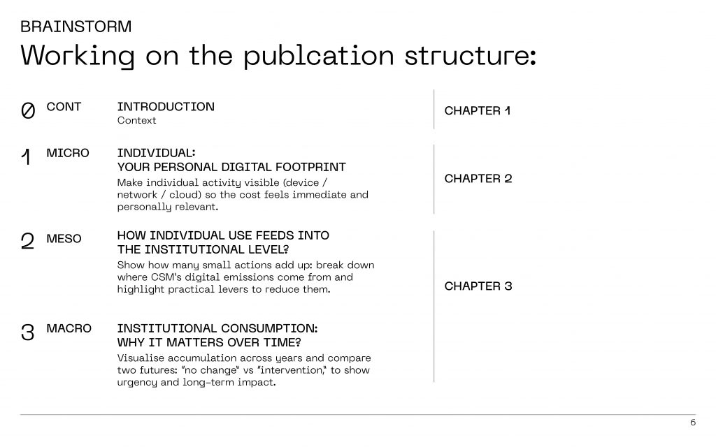
“This is the same structure again, but it’s with chapters we started translating this into dedicated materials for publication contents.
So chapter 1 corresponds to context
Chapter 2 corresponds to invidivual behaviour.
Chapter 3 to how it scales into the institution.
Chapter 4 to conclusion
⸻
Slide 8
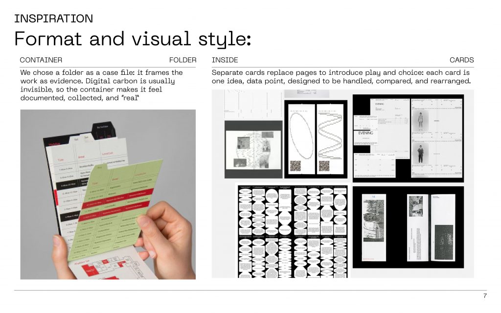
“We chose the folder as a container — like a case file.
Because digital carbon is often abstract, we wanted it to feel like evidence: documented, collected, real.
And instead of traditional pages, we used separate cards, so each card is one idea you can hold, compare, and reorder.
It makes the information feel less like a lecture, and more like a discovery.”

⸻
Slide 9
“Now we move into Chapter 2 — this is where we create the hook.
We show personal digital footprint in two ways:
first as data, then as a receipt.”

⸻
Slide 10-11
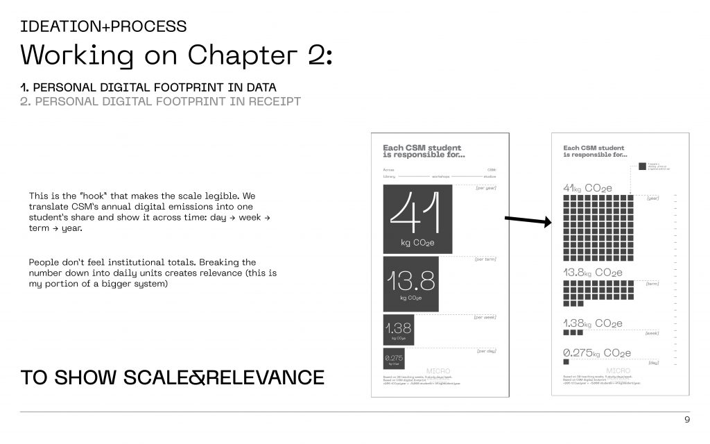
“This is the moment we try to make the scale legible.
Instead of giving a huge institutional total, we translate CSM’s annual digital emissions into one student’s share, and then we show it over time: day, week, term, year.
Because most people don’t emotionally connect to a number like ‘CSM emits X tonnes’.
But they do connect to: ‘Oh — this is my portion of a bigger system, every day.’”
⸻
Slide 12
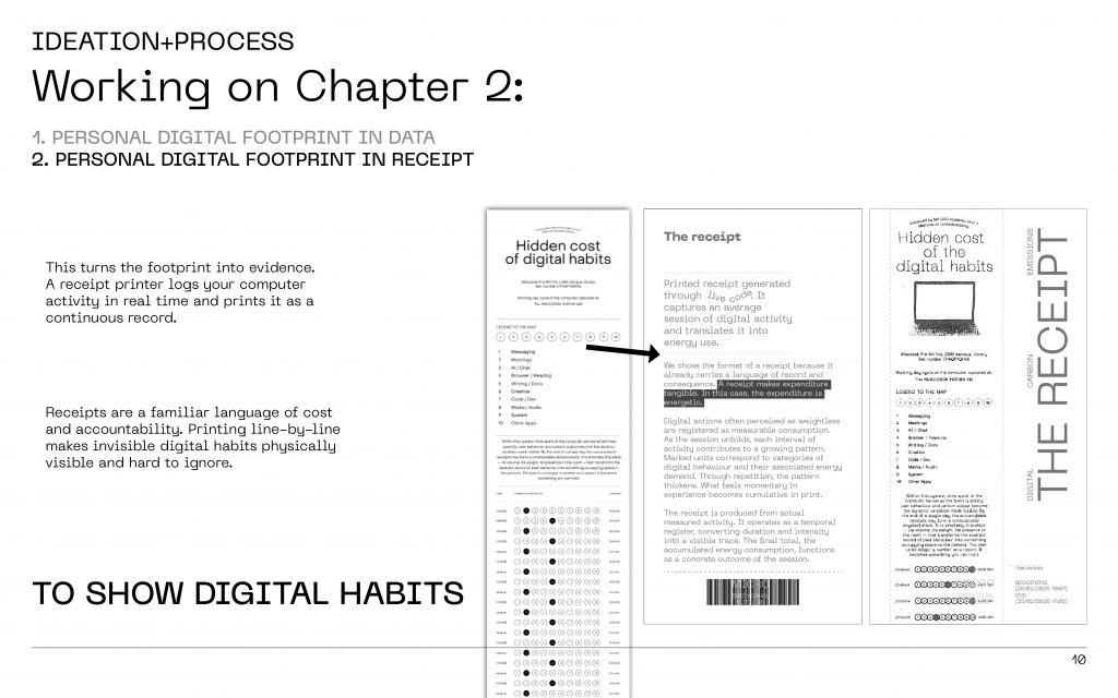
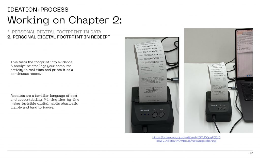
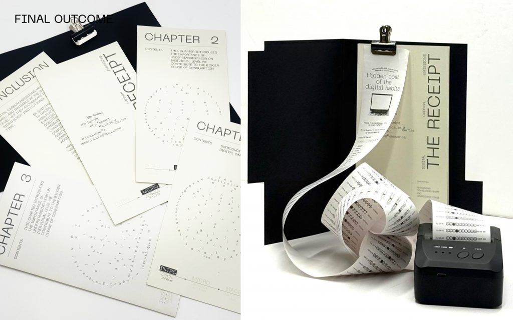
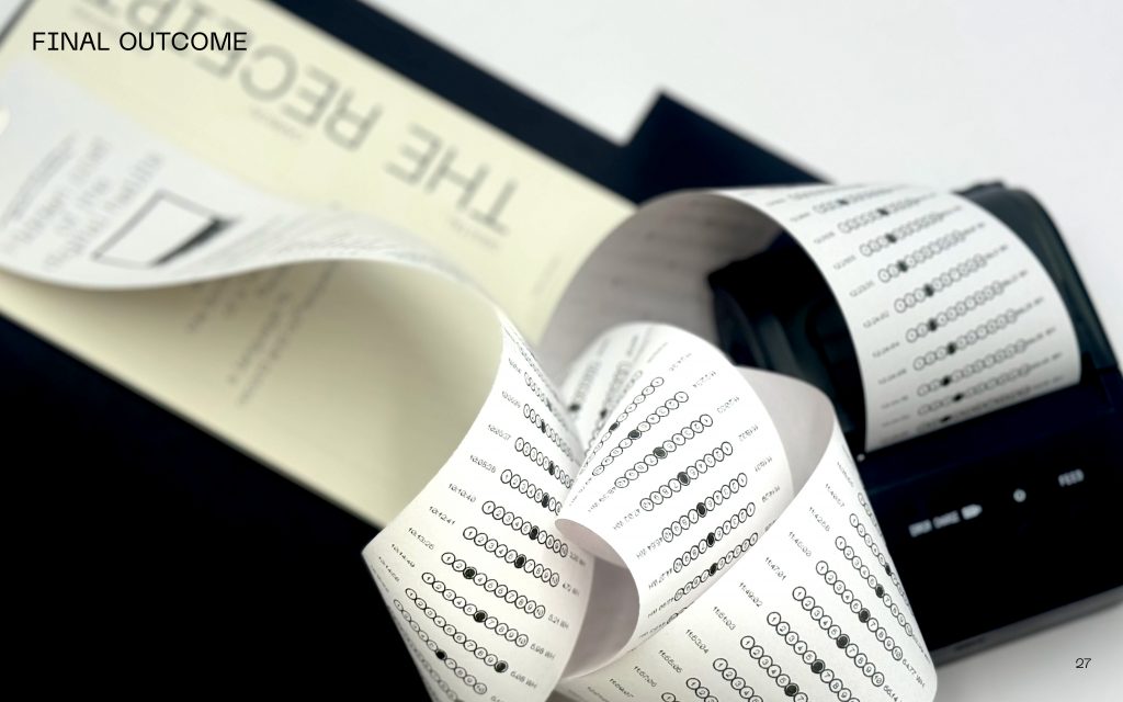
“Then we turn that footprint into evidence.
We use a receipt printer to log activity in real time and print it as a continuous record.
Receipts are a familiar language — they signal cost and accountability.
So printing line by line makes digital habits visible in a way that’s hard to ignore — it becomes physical.”
⸻
Slide 13
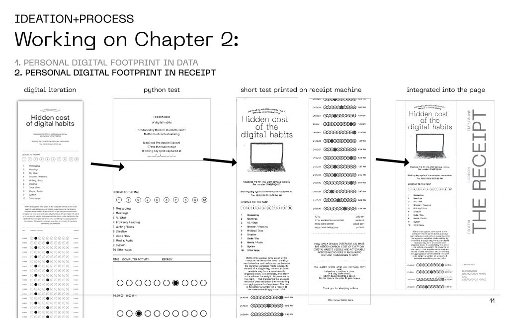
“This slide is basically the behind-the-scenes pipeline:
We start with a digital layout, we test outputs in code, we print small prototypes, and then we integrate that printed material back into the publication.
⸻
Slide 14
“And this is the prototype in real life.
When you watch it print, you suddenly feel time passing.
And you realise: even ‘small’ actions stack up — not because one email is huge, but because the behaviour repeats.”
(Optional live moment: if you’re bringing the printer, this is where you show it for 5–10 seconds.)
⸻
Slide 15
We connect the individual to the institution, and then to time — to show why this matters beyond the moment.”
⸻
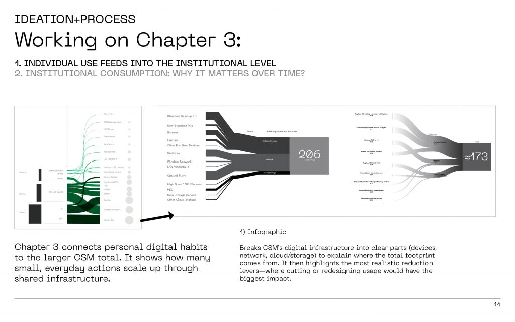
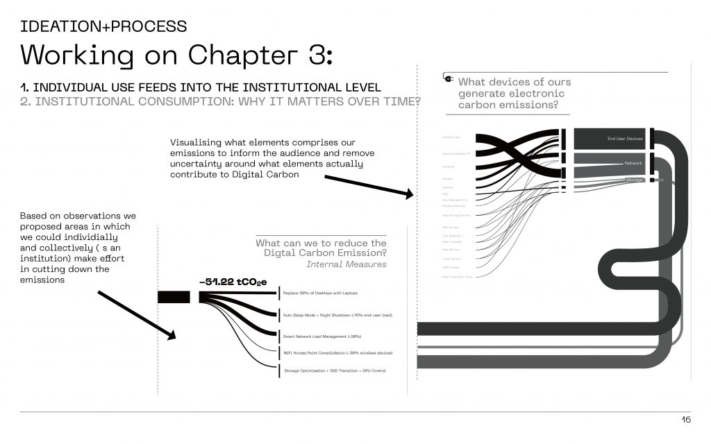
Slide 16
“Here we take CSM’s digital infrastructure and break it into clear parts: devices, network, and cloud/storage.
The goal is to remove uncertainty — to answer the question:
‘What actually contributes to digital carbon?’
And then we highlight realistic levers — changes that are practical, not perfect fantasies.”
⸻
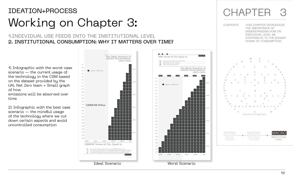
Slide 17
“We experimented with merging two types of visuals:
one that shows structure — where emissions come from — and one that shows time — what happens if we do nothing.
This was part of making the narrative flow: from cause → to system → to consequence.”
⸻
Slide 19
“This is where we shift from awareness to action.
We propose internal measures — like switching desktops to laptops, better sleep/shutdown habits— that we observed was a common problem in the library, smarter network load management, WiFi access point consolidation, storage optimisation.
Even if each change feels small, together they create meaningful reduction.
⸻
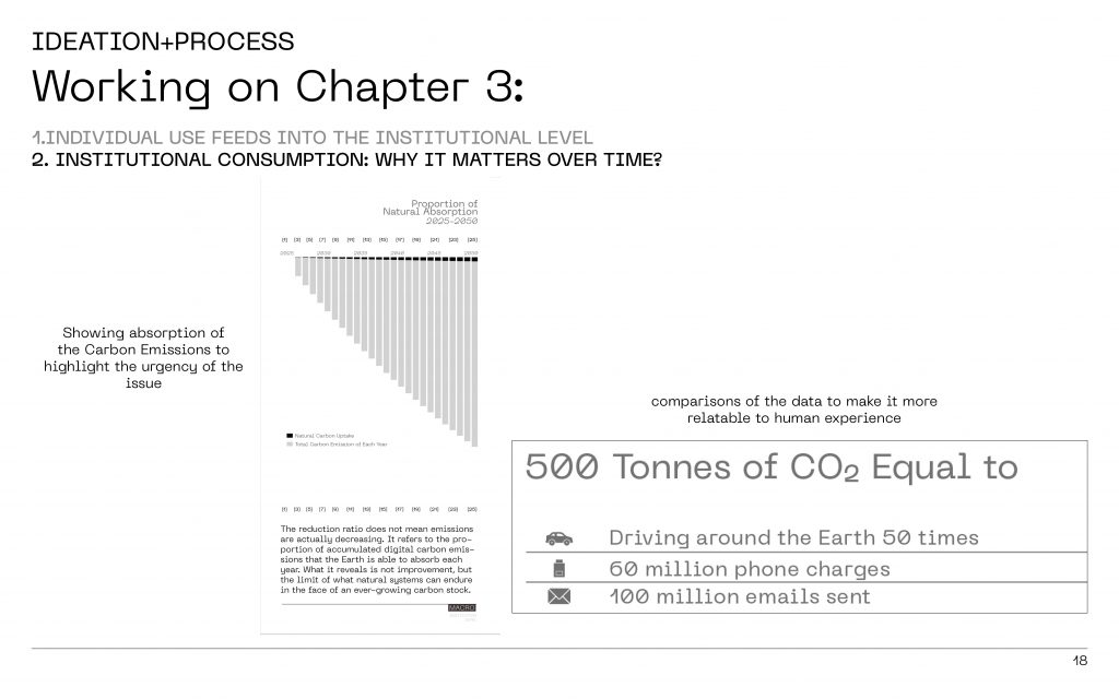
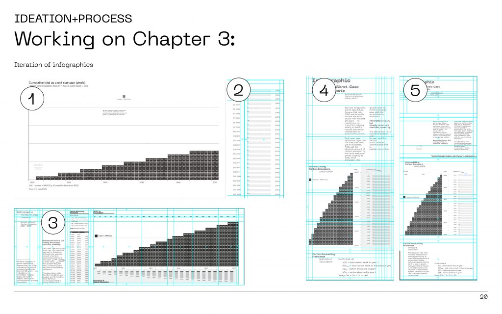
Slide 20
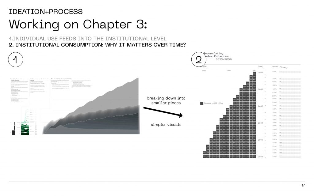
“Here this is an example of how we iterated the infographic:
The design decision here was to keep it simple.
Instead of one giant chart, we break it into smaller pieces so the message feels clear of that
individual choices and institutional choices matter a lot and can affect the future.
⸻
Slide 21
“And we add a time perspective: emissions don’t just disappear — they remain and are absorbed slowly.
So the ‘cost’ is not just now, it’s long-term.
We also translate 500 tonnes into human comparisons — like driving around the Earth many times, millions of phone charges, or emails sent — just to make the scale feel graspable instead of abstract.”
⸻
Slide 22
“This is our core argument in one moment:
Personal contribution matters — but it matters even more when paired with institutional changes.
We’re not blaming individuals — we’re showing how everyday behaviour plugs into shared infrastructure, and how the institution can redesign the default routines and habits.”
⸻
Slide 23
“This page shows our iterations.
You can see how we moved toward more legible structure: clearer hierarchy, cleaner grids, and better narrative.
The goal was always the same to make the content readable within seconds and make it feel relevant and simple.”
⸻
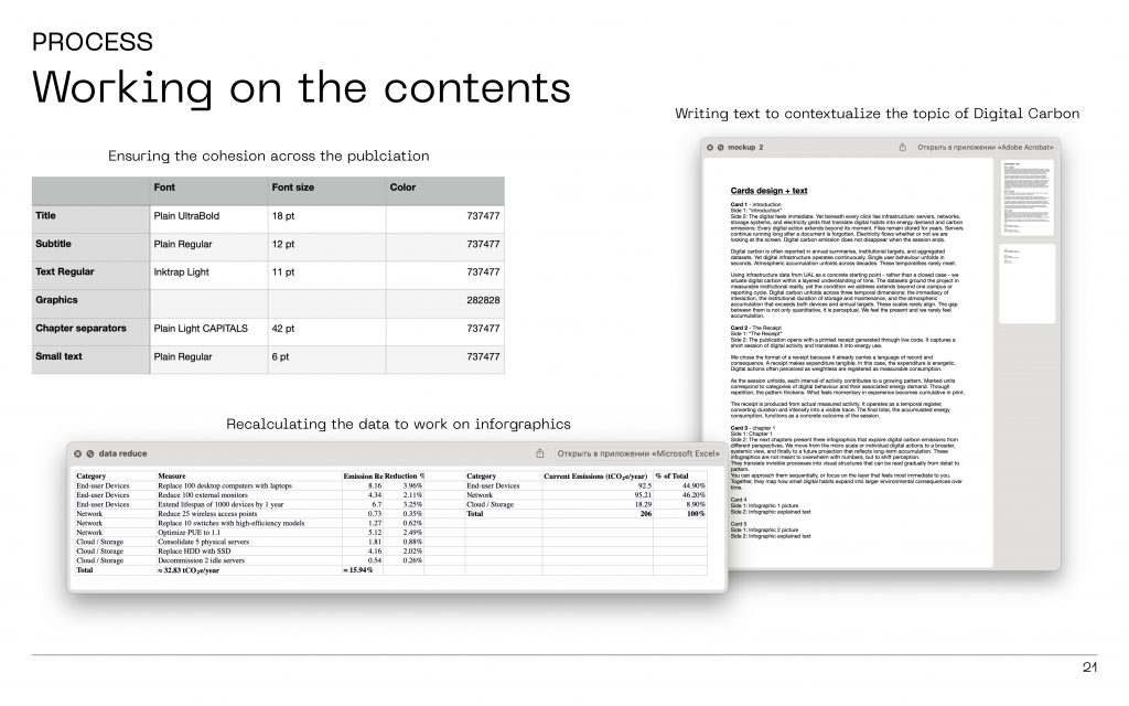
Slide 24
“This was part of the process of working on the contents:
We rebuilt the publication system — typography, layout rules, consistency.
We recalculated data so the visuals stay accurate.
And we wrote contextual text so the audience will informed and follow our publication’s narrative — because the story matters as much as the numbers.
⸻
Slide 25
“This was part of the process of working on the contents:
We rebuilt the publication system — typography, layout rules, consistency.
We recalculated data so the visuals stay accurate.
And we wrote contextual text so the audience will informed and follow our publication’s narrative — because the story matters as much as the numbers.
⸻
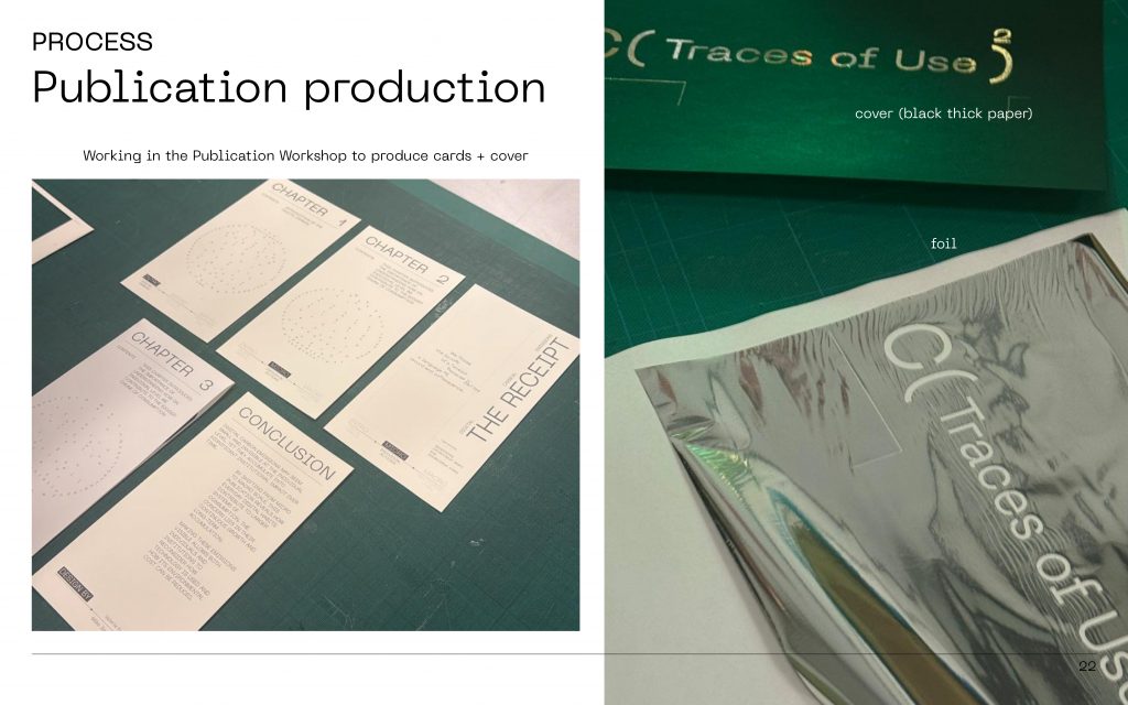
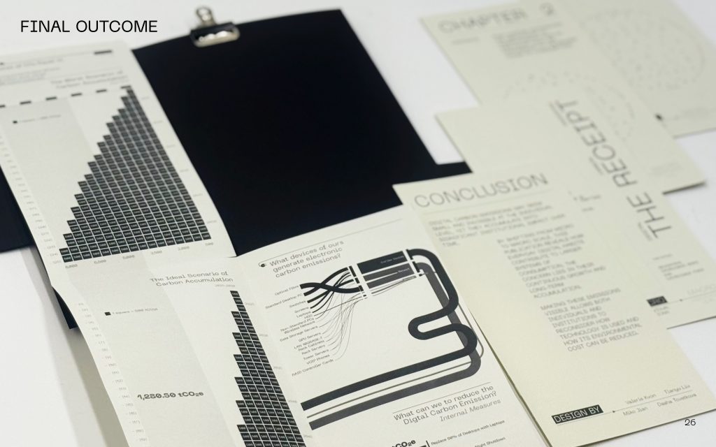
Slide 26
“And after designing everything digitally we physically produced the cards in the publication workshop.
⸻
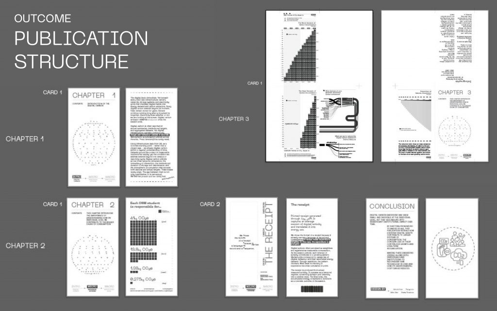
Slide 27
“This is the final structure as a set of cards:
Chapter 1 introduces the theme,
Chapter 2 makes it personal through data + receipt,
Chapter 3 shows system + future scenarios,
and then we close with a conclusion.
It’s designed like a guided story — but still gives people the freedom to explore.”
⸻
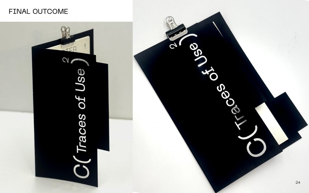
Slide 28
“This is the final outcome.The folder frames it like evidence.The receipt becomes the physical ‘proof’ of digital habits.And together, they shift digital carbon from something invisible and forgettable into something you can literally hold.”
⸻
Slide 29
Leave a Reply