Digital Carbon Emission-Feb 20th
Script
“Hi, we’re Valerie, Miko, Tianyu, and Dasha. This is our Unit 1 update on Methods of Iterating. We’ll walk you through how we moved from research into digital carbon, to a prototype, and then to a publication concept that makes the issue easier to perceive and act on.”
Script
“First, we collectively decided to focus on digital carbon — the emissions connected to everyday digital activity, like devices, networks, and cloud services. It’s often discussed as a relatively small share of overall emissions — commonly estimated around a few percent — but it’s growing fast as digital services become embedded into daily life.
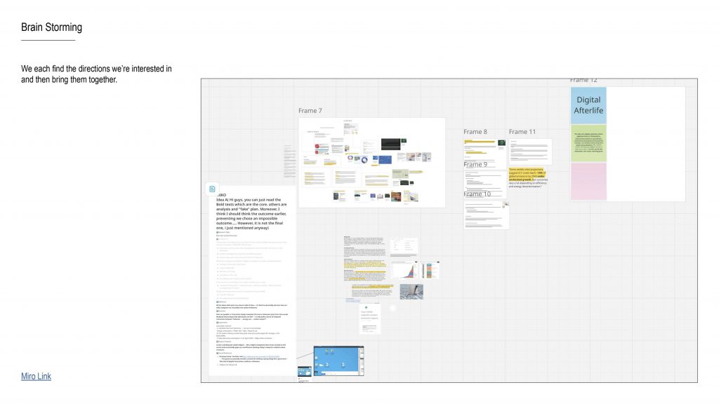
We started with research, then opened up a wide brainstorm on a Miro board: different formats, interaction ideas, and ways to make the topic feel more engaging, more personal, and more actionable, instead of staying as abstract statistics.”
Script
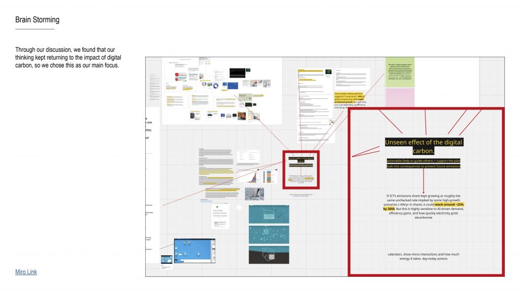
“As we discussed, our thinking kept returning to one key issue: digital carbon is easy to overlook because it doesn’t feel visible, and it often appears ‘small’ compared to other sectors.
So we reframed our focus around the unseen effect: even small emissions can accumulate over time, and because digital habits are widespread, they’re also something we can potentially reduce through collective effort.”
Bridge line:
“So our question became less about ‘is it big or small’, and more about: why is it so easy to ignore — and what would make it feel real?”
Script
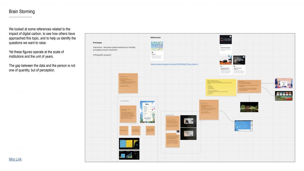
“We reviewed existing references and projects dealing with digital carbon, to understand how the topic has been communicated so far — and what feels missing.
A lot of the existing material works at the scale of institutions and the unit of years. That’s useful, but it creates distance.
So we identified a key gap: the gap between data and a person is not only about quantity — it’s about perception. People don’t feel yearly totals emotionally, and they can’t link them to everyday behaviour.”
Script
“Hi, we’re Valerie, Miko, Tianyu, and Dasha. This is our Unit 1 update on Methods of Iterating. We’ll walk you through how we moved from research into digital carbon, to a prototype, and then to a publication concept that makes the issue easier to perceive and act on.”
Script
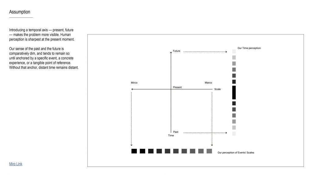
“Our first assumption is that adding a temporal axis — present, past, future — makes the problem more visible.
Human perception is sharpest in the present moment. The past and future feel vague unless they’re anchored by something concrete — a specific event, a tangible object, or a lived experience.
So the design opportunity is: if we can create that anchor, then distant time doesn’t stay distant.”
Script
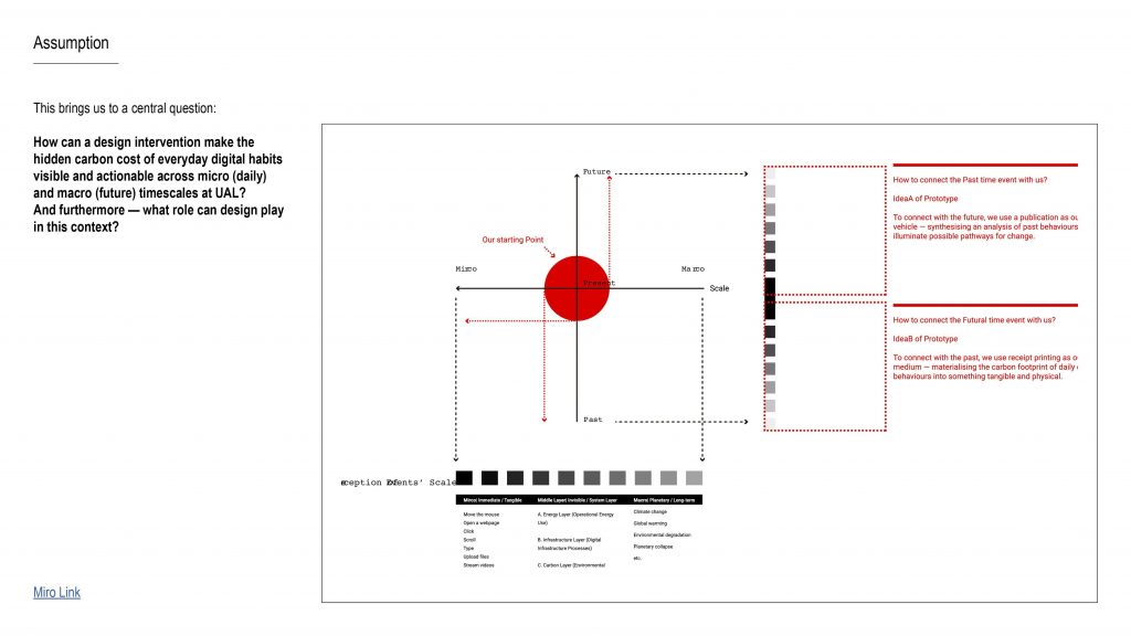
“This brings us to our central question:
How can a design intervention make the hidden carbon cost of everyday digital habits visible and actionable across micro (daily) and macro (future) timescales at UAL?
And more broadly: what role can design play in turning climate-related data into something people can actually sense, understand, and respond to?”
Script
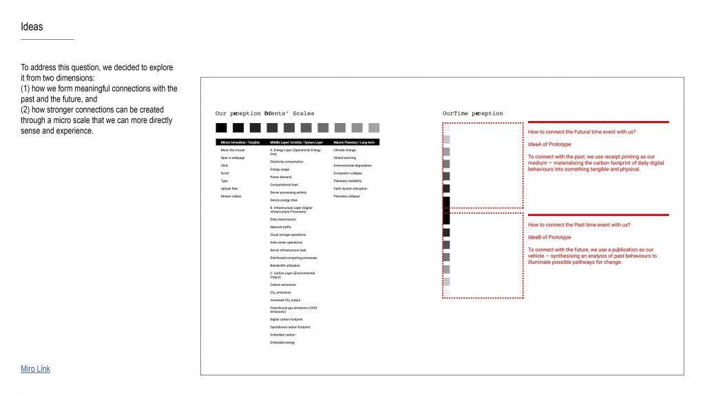
“To respond, we explored two connected dimensions:
-
How we form meaningful connections with the past and future, and
-
How the micro scale — daily behaviour — can be made more legible through direct, sensory experience.
So we’re designing not just an explanation, but a shift in how the issue is felt: from abstract information to something that lands in everyday life.”
Script
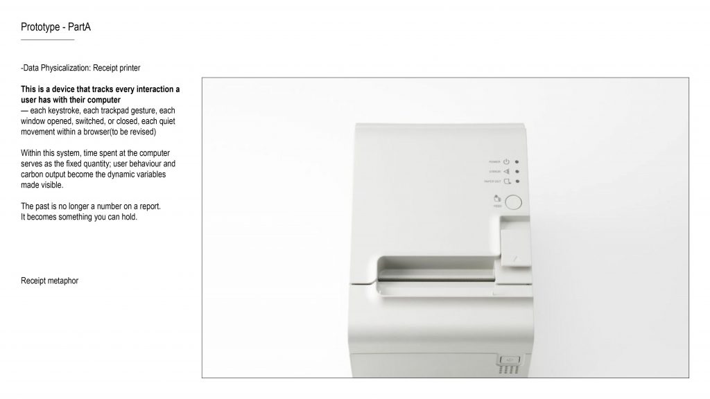
“Our first direction uses data physicalisation — translating behaviour and its consequences into something you can experience through your senses.
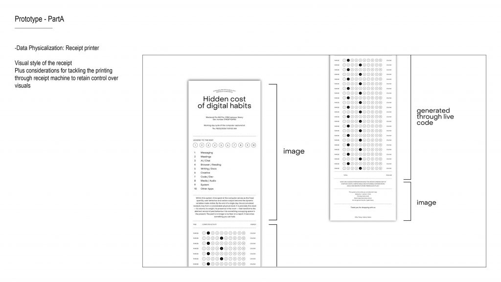
We propose a Time Receipt Printer: a device that tracks a user’s computer activity and prints a receipt in real time. Each receipt line registers what happened and an estimated carbon cost.
The key metaphor is the receipt: it normally represents a transaction you accept without thinking. Here, it represents the hidden ‘cost’ of daily digital habits. By printing continuously, the receipt can physically grow, turning invisible accumulation into something you can’t ignore.
So the past stops being a number in a report — it becomes something that occupies space in the present.”
Small clarity tweak (optional):
“Right now we’re prototyping at the level of app activity categories, and iterating toward more granular behaviours later.”
Script
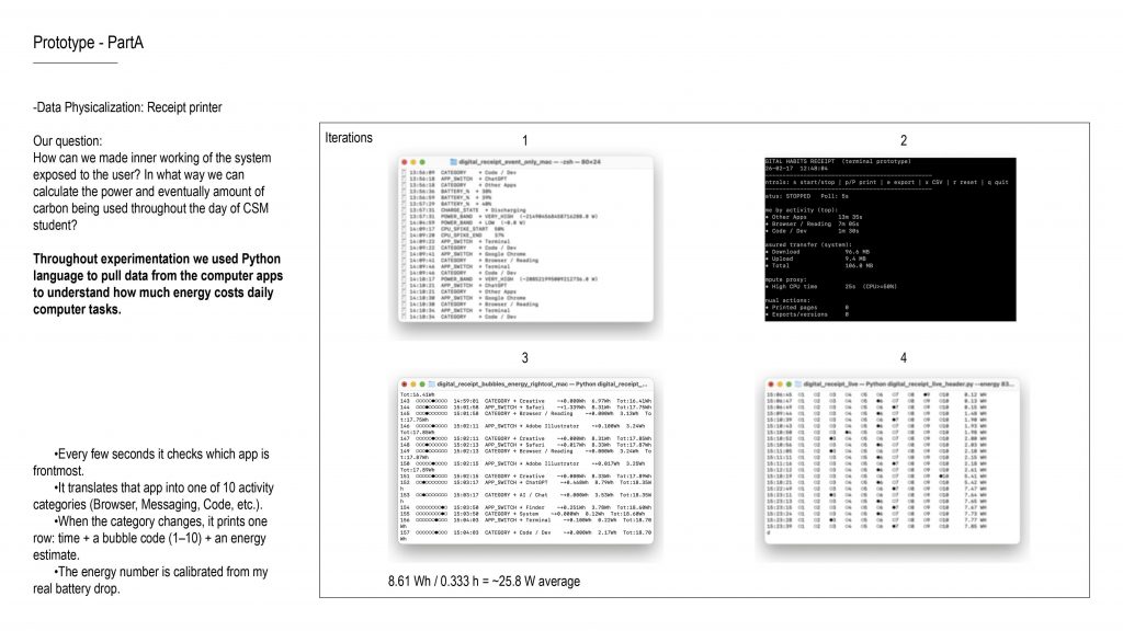
“Our prototyping question was:
How can we expose the inner workings of the system to the user — and how can we estimate energy and carbon from everyday student computer use?
To test this, we built a Python prototype that logs activity and produces a receipt-like output. The flow is:
-
Every few seconds, it checks which app is frontmost.
-
It translates the app into one of about ten activity categories — like Browser, Messaging, Code, etc.
-
When the category changes, it prints one row: time, a bubble code for the category, and an energy estimate.
-
The energy estimate is calibrated using a real battery drop measurement — so it stays grounded in a real device session.”
Script
“Here we started defining the visual language of the receipt — what makes it readable at a small width, and what can be reliably printed by a receipt printer.
We’re also considering technical constraints: receipt printers are limited in resolution and colour, so the design needs to stay high-contrast, simple, and consistent”
Script
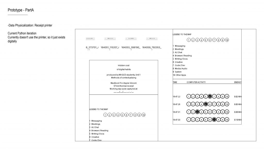
“At the moment, the prototype output exists digitally and doesn’t yet print directly from the receipt machine — but it already generates receipt-like rows and category codes.
So the next step is connecting the pipeline end-to-end: logging → formatting → direct printing, while keeping the visuals consistent.”
Script
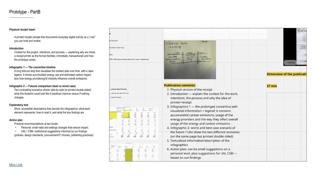
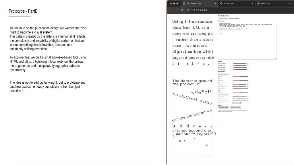
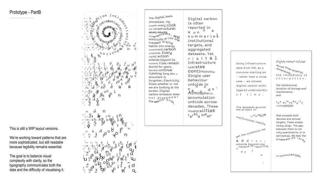
So for Part B, we developed a publication that extends from our physical installation.
The publication is structured into four sections.
The first section includes the actual receipts we printed.
These receipts visualize the carbon emissions generated by our everyday computer use.
They transform what is normally invisible accumulation into something tangible — something you can literally hold in your hands.
The second section introduces the project itself, including the background, the research context, and our core question.
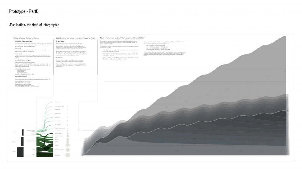
The third section consists of two infographics.
One presents a worst-case scenario of future carbon emissions.
The other explores the most ideal scenario and what reduction might realistically look like.
The final section is educational.
It moves from the individual scale to the institutional scale, discussing practical ways digital carbon emissions could be reduced.
Script
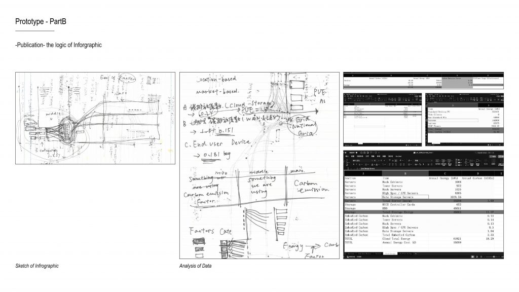
This is our first draft of the infographic.
Script
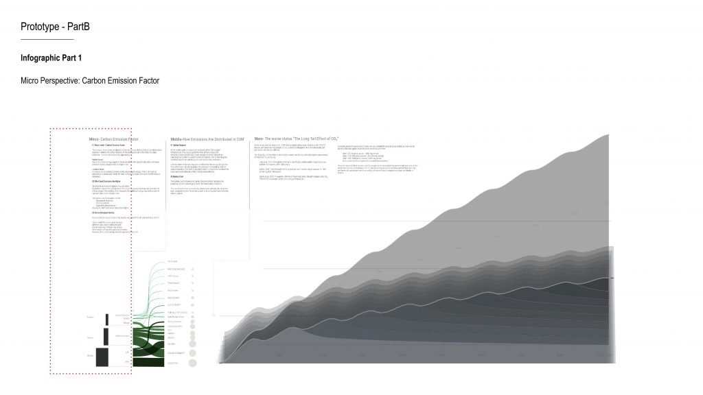
During our analysis, we identified a very important micro-level perspective — the carbon emission factor.
This factor depends on the energy mix of the electricity supplier.
So in other words, the same amount of electricity consumption can result in very different carbon emissions depending on where that electricity comes from.
Across our three main categories, we calculated three different emission factors.
Cloud storage has the highest factor.
This is because, in addition to the base electricity emissions, it also needs to be multiplied by a PUE factor — Power Usage Effectiveness — which measures the energy efficiency of data centres.This helped us realise that carbon emissions are not just about how much electricity is used, but also about where that electricity comes from and how efficiently it is managed.
Script
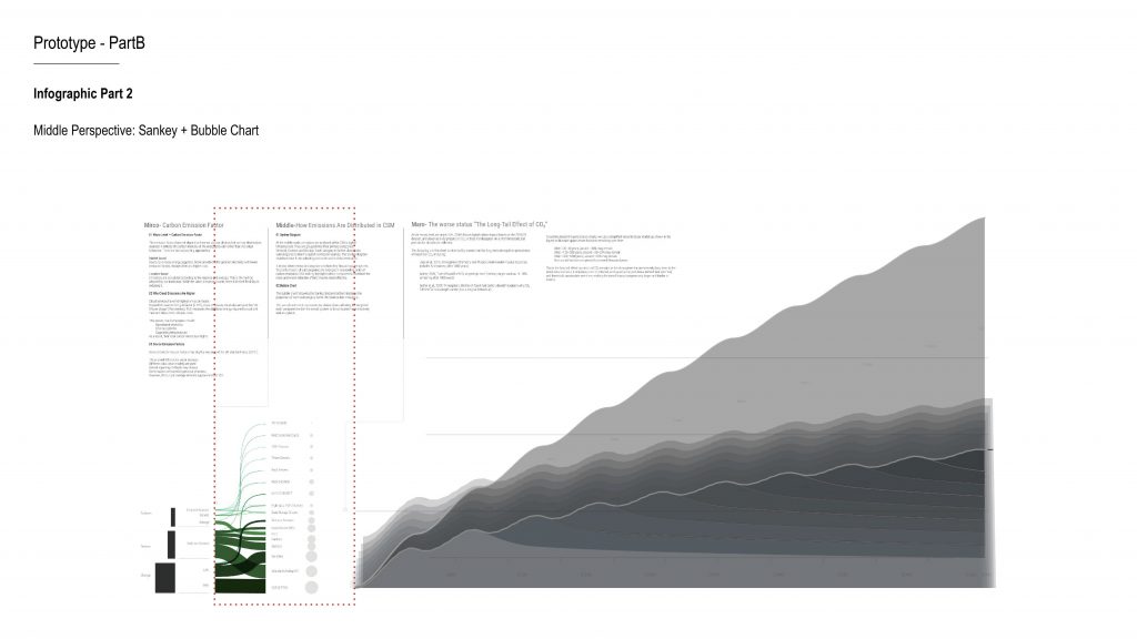
The second infographic combines a Sankey diagram with a bubble chart.
We broke the three major categories down into smaller subcategories and visualised their proportions.
This allows us to clearly see, within CSM’s digital infrastructure, which components account for the largest share of emissions.
For example, optical fibre infrastructure appears visually significant in proportion.
This reminds us that digital carbon emissions are often embedded within underlying infrastructure — not just in end-user devices.
Script
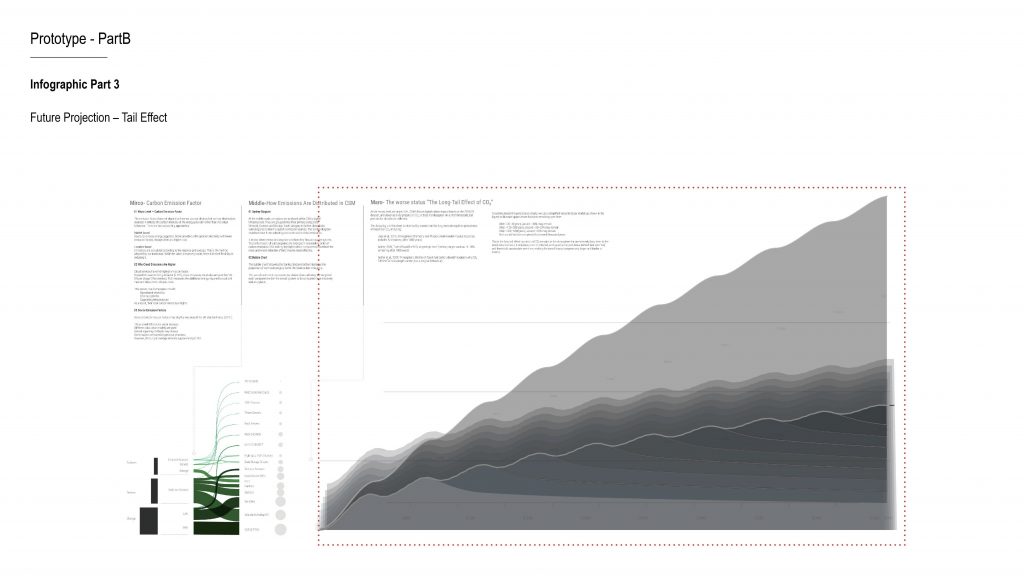
In the final section, we shift to a future perspective and re-examine this year’s carbon emissions over time.
We introduce what we call the “tail effect,” which refers to the long-term persistence of carbon dioxide in the atmosphere.
We used AI to simulate how much of today’s emissions would remain every 50 years.
In the worst-case scenario, we assume emissions continue to increase.
We subtract the Earth’s natural absorption capacity, and what remains accumulates over time.
This produces a stacked area chart that visualises long-term carbon persistence.
In the ideal scenario, we start by reducing the carbon emission factor — for example, by switching to market-based electricity suppliers.
However, we are still thinking about what further optimisation could look like, particularly in terms of cloud storage and network usage.
How minimal can our digital infrastructure realistically become?
Ultimately, these two infographics function as a comparison:
What happens if we do nothing?
And how much could change if we restructure the system?
and then next is the structure of our prototype
Script
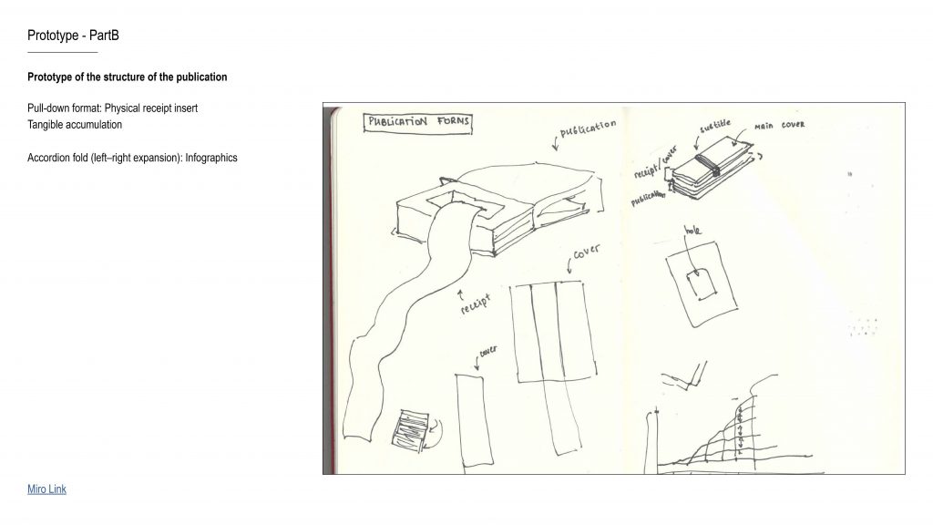
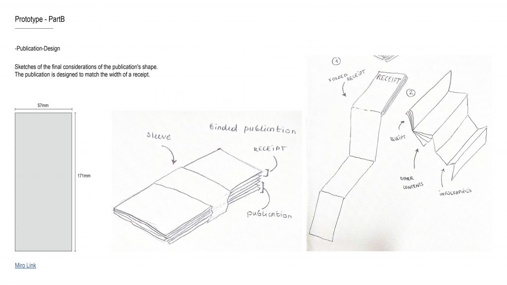
We also discussed different binding and format options for the publication, and eventually decided on this structure.
The size of the publication matches the width of the receipt, so they can integrate seamlessly.
The long receipt is folded vertically and inserted into the book, while the wider infographic is folded horizontally to fit inside.
Script
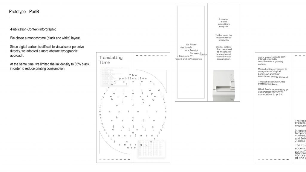
We chose a monochrome layout — so just black and white.Because digital carbon is something we can’t really see, we decided to work with a more abstract typographic approach to reflect that invisibility.And we also limited the ink to 85% black, as a small gesture to reduce printing consumption.
Script
We also discussed different binding and format options for the publication, and eventually decided on this structure.
The size of the publication matches the width of the receipt, so they can integrate seamlessly.
The long receipt is folded vertically and inserted into the book, while the wider infographic is folded horizontally to fit inside.
Script
Leave a Reply